Have you ever picked a color you loved, then tried it on and felt like it did not quite suit you? I have too.
Summer color analysis can make those choices easier by looking at how soft, cool, light, or muted a shade feels against your natural coloring.
I like using it as a simple starting point, not a strict rulebook.
The goal is not to limit your style, but to help you choose colors that feel more balanced, flattering, and naturally you.
What Is Summer Color Analysis?
Summer color analysis is part of the seasonal color system and focuses on shades that complement naturally cool, soft coloring.
Summer palettes typically feature cool or neutral-cool undertones, gentle contrast, and colors that range from light to medium in depth. Rather than bold or highly saturated tones, the season favors softer, more muted shades.
In the 12-season color system, Summer is divided into three subtypes: Light Summer, Cool or True Summer, and Soft Summer, each with a slightly different balance of temperature, depth, and softness.
Summer Color Types
Light Summer

Light Summer is influenced most by lightness. The overall coloring tends to look fresh, delicate, and low-contrast.
Shades such as powder blue, soft pink, lavender, pale mint, and cool beige often fit well because they keep the look airy rather than heavy.
Cool Summer

Cool Summer is driven most by temperature. Its colors lean clearly cool, with very little visible warmth.
Dusty rose, cool blue, berry, soft navy, lavender, and blue-based reds usually suit this subtype because they match its crisp but still softened appearance.
Soft Summer

Soft Summer is influenced most by mutedness.
The coloring often appears blended rather than sharp, so softer shades tend to feel more natural.
Muted teal, mauve, smoky blue, sage, taupe, and rose brown work well because they keep contrast gentle and avoid looking too bright.
Differences Between Summer Color Types
The easiest way to tell the three Summer types apart is to look at which color quality stands out most.
|
Summer Type |
Main Feature |
Best Color Direction |
Usually Avoid |
|---|---|---|---|
|
Light Summer |
Lightness |
Pale cool shades |
Very dark colors |
|
Cool Summer |
Coolness |
Cool blue-based shades |
Warm golden tones |
|
Soft Summer |
Mutedness |
Soft muted shades |
Very bright colors |
How to Know If You Have a Summer Color Palette?
Hair and eye color can provide clues, but they should not determine your season by themselves.
- Cool undertones: Blue-based shades often look more natural than warm yellow tones.
- Ashy hair: Hair may have less golden or reddish warmth.
- Soft eye colors: Gray, blue, green, hazel, and muted brown are common.
- Low contrast: Hair, skin, and eyes often blend softly together.
- Muted colors suit best: Soft cool shades usually look more balanced than very bright
Cool Summer Color Palette

Note: Summer palettes are not limited to pastels. Soft blues, muted teals, berries, plums, and cool grays can add depth while keeping the overall look gentle and cool.
How to Build a Cool Summer Wardrobe?

- Casual: Pair soft navy with dusty rose for an easy everyday look.
- Work: Combine dove gray with muted blue for a polished outfit.
- Weekend: Wear cool-toned denim with soft lavender.
- Evening: Pair soft plum with charcoal for subtle depth.
- Warm Weather: Combine powder blue with pearl white for a lighter palette.
- Cool Weather: Layer dusty teal with soft navy for a richer look.
Best Metals and Accessories for Cool Summer
- Cool-toned metals generally fit most naturally within a Cool Summer palette. Silver, white gold, and platinum complement its cool, muted quality without creating strong contrast.
- Pearls and moonstone can also work beautifully because their soft finish reflects the gentle character of the palette. If you prefer rose gold, look for subtle, muted finishes rather than warmer or strongly pink versions.
- Bright yellow gold creates more warmth and contrast, so it may feel less harmonious with typical Cool Summer shades.
How to Test Summer Colors at Home?
You can test Summer colors at home with clothing, fabric swatches, or an online color analysis tool. For a more accurate comparison, use indirect natural light, wear little or no makeup, and pull your hair away from your face.
Hold different shades near your face and compare warm colors with cool ones, followed by bright colors with softer, muted versions.
Focus on your complexion rather than the color itself. Look for shades that make your skin look balanced and even, rather than emphasizing redness or shadows.
Compare several colors before deciding which Summer subtype feels closest to you.
Cool Summer vs Cool Winter
|
Feature |
Cool Summer |
Cool Winter |
|---|---|---|
|
Overall Look |
Soft and blended |
Clear and striking |
|
Best Colors |
Dusty blue, mauve, soft navy |
Cobalt, true red, icy pink |
|
Contrast |
Low to medium |
Medium to high |
|
Intensity |
Muted |
Bright |
|
Best Neutrals |
Soft gray, charcoal, navy |
Black, crisp white, deep navy |
|
Avoid |
Very bright or harsh shades |
Dull or overly muted shades |
Common Summer Color Analysis Mistakes
A few simple mistakes can make it harder to identify your Summer palette accurately.
- Relying on one color: Test several shades before deciding.
- Using poor lighting: Artificial light can change how colors look.
- Focusing only on skin tone: Hair and eye coloring also matter.
- Choosing colors that are too bright: Summer palettes usually suit softer shades better.
- Following online quizzes alone: Use them as a starting point, not the final answer.
Conclusion
Summer color analysis becomes much easier when you focus less on following a perfect palette and more on noticing which colors make you feel naturally put together.
I like to think of the Summer palette as a helpful direction rather than a strict set of rules.
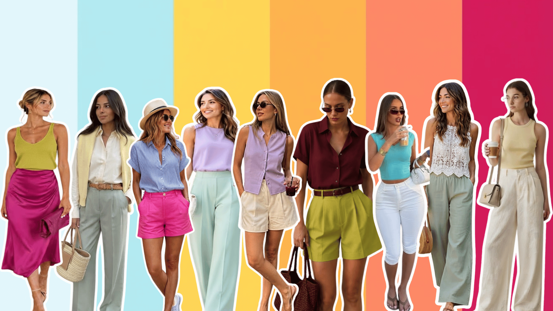
Start with a few cool blues, soft pinks, muted purples, and gentle neutrals, then see how they work with the clothes you already own.
As we become more familiar with our best color qualities, getting dressed and shopping can feel more intentional. Most importantly, keep wearing the shades that make you feel like yourself.
Have you found your Summer subtype yet? Share your experience in the comments below.
Frequently Asked Questions
Can Summer Color Types Wear Red?
Yes. Cooler reds such as raspberry, cranberry, rose red, or blue-based berry shades generally fit Summer palettes more naturally than orange-reds.
Is Denim Good for a Summer Palette?
Yes. Cool blue, medium-wash, faded, and blue-gray denim can coordinate especially well with Summer colors and work as practical wardrobe neutrals.
Can Your Color Season Change With Age?
Natural coloring can shift with age, especially as hair grays and contrast changes. Your most flattering depth or intensity may therefore appear somewhat different over time.