I used to think kitchen cabinets had to match perfectly, or the space would feel off. Then I started noticing two-tone kitchen cabinet ideas everywhere, and they finally made sense—even in unexpected places like a wardrobe sale where contrasting finishes are used just as effectively.
You get contrast without making the kitchen feel heavy or closed in. You’ve probably seen kitchens where the colors feel unbalanced or the cabinets overpower the room.
Choosing the right mix can fix that and make the space feel clearer and easier to live with. In this post, I walk through real layout options, color pairings, and practical design choices that actually work in everyday kitchens.
By the time you reach the end, two-tone kitchen cabinet ideas will feel far less confusing and much easier to plan.
The Basics of Two-Tone Kitchen Cabinet Design
A two-tone kitchen cabinet design means using two different cabinet colors or finishes in one kitchen.
You usually see this done by separating upper and lower cabinets or changing the cabinet color on the island. This approach helps break up large cabinet runs and adds visual balance without making the space feel heavy.
Lighter colors are often used on upper cabinets to keep the room open. Darker or richer tones work well on lower cabinets or islands to ground the layout. Another option is mixing painted cabinets with wood finishes for warmth.
When planned well, two-tone cabinets help define different areas of the kitchen while keeping everything connected and easy on the eyes.
Two-Tone Kitchen Cabinet Ideas by Color Combination
Color contrast helps separate cabinet zones, control visual weight, and guide how the kitchen feels overall, from light and open to grounded and structured.
1. White Uppers With Dark Lower Cabinets
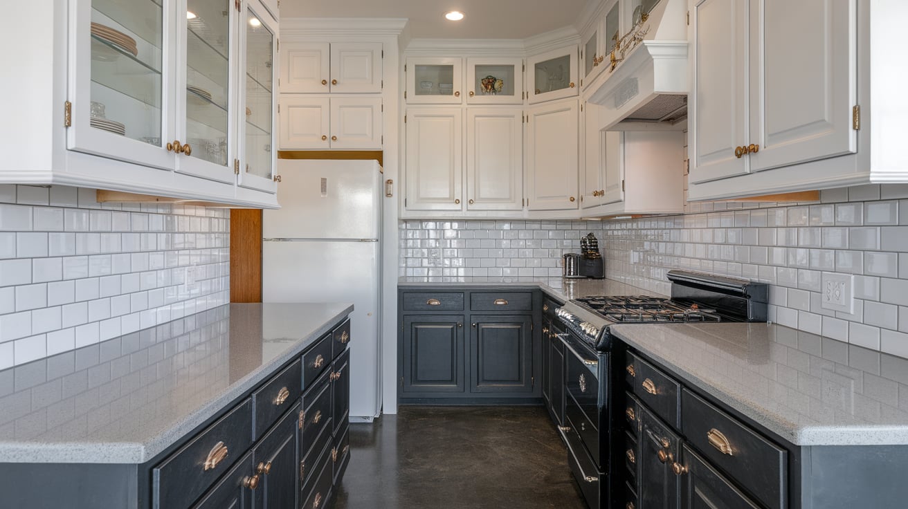
This combination is one of the most common and practical two-tone layouts. White upper cabinets reflect light and keep the kitchen from feeling closed in, especially in rooms with limited windows.
Dark lower cabinets anchor the space and help hide daily wear like scuffs and fingerprints.
Popular lower colors include charcoal, deep gray, espresso, and muted black. This setup works well in both small and large kitchens because it balances brightness with depth.
It also pairs easily with many countertop materials, including quartz, butcher block, and stone. To keep the look consistent, repeat the darker color in hardware, lighting, or flooring elements.
2. Navy and White Kitchen Cabinets
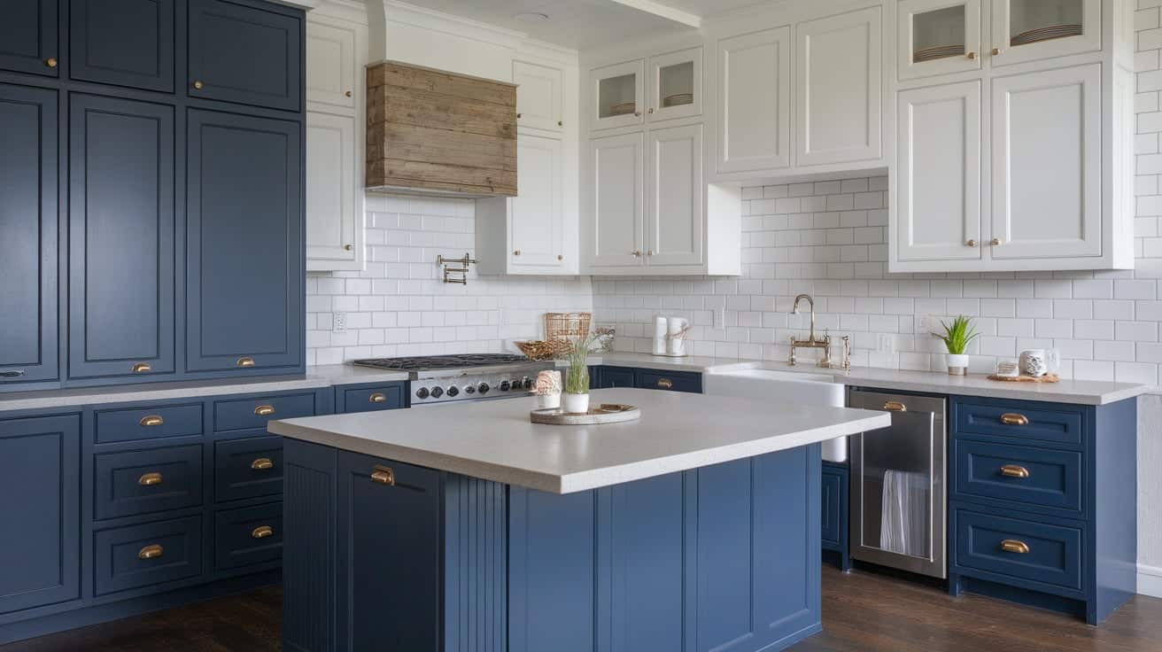
Navy and white cabinets offer contrast without feeling harsh.
White cabinets keep the kitchen bright, while navy adds depth and a grounded feel. This pairing works well in traditional, coastal, and modern kitchens, depending on cabinet style and hardware.
Navy is often used on lower cabinets or islands to prevent the space from feeling too dark. White uppers help bounce light around the room and keep sightlines open. This color combination pairs well with brass, black, or chrome hardware.
wqd qffLight countertops and backsplashes help keep the kitchen balanced and prevent the darker color from taking over.
3. Black and White Kitchen Cabinets
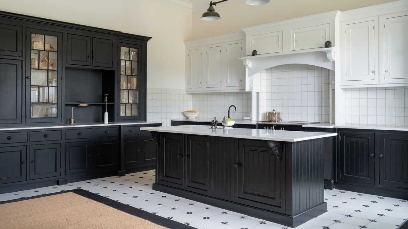
Black and white cabinets create a strong contrast and clear structure. White cabinets usually work best on upper sections to keep the kitchen from feeling heavy.
Black lower cabinets or islands provide definition and help ground the layout. This pairing suits modern and classic kitchens alike when finishes are chosen carefully. Matte black can feel softer than high-gloss finishes, especially in kitchens with limited light.
White countertops and simple backsplashes help maintain balance. To avoid a sharp look, repeat black in small details like cabinet pulls or light fixtures rather than large surfaces.
4. Gray and White Two-Tone Cabinets
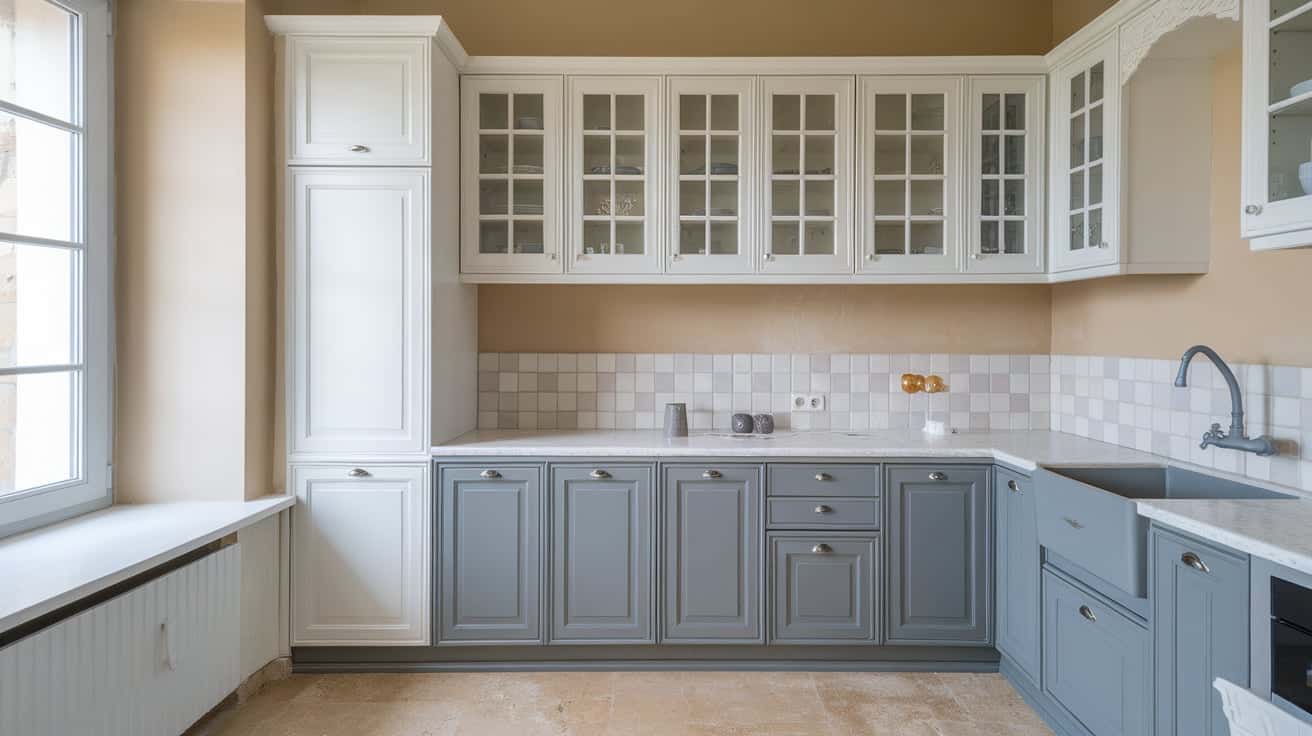
Gray and white cabinets offer a softer contrast than black and white. This combination works well in kitchens that need a calm and neutral look.
Light gray lowers paired with white uppers keep the space open while still adding separation between cabinet levels.
Warmer gray tones work better with wood floors, while cooler grays pair well with stone or tile. This setup fits well in both modern and traditional kitchens. Simple hardware and clean cabinet lines help keep the look cohesive.
Gray and white cabinets also make it easy to change wall colors or accessories later.
5. Cream and Blue Cabinet Pairings
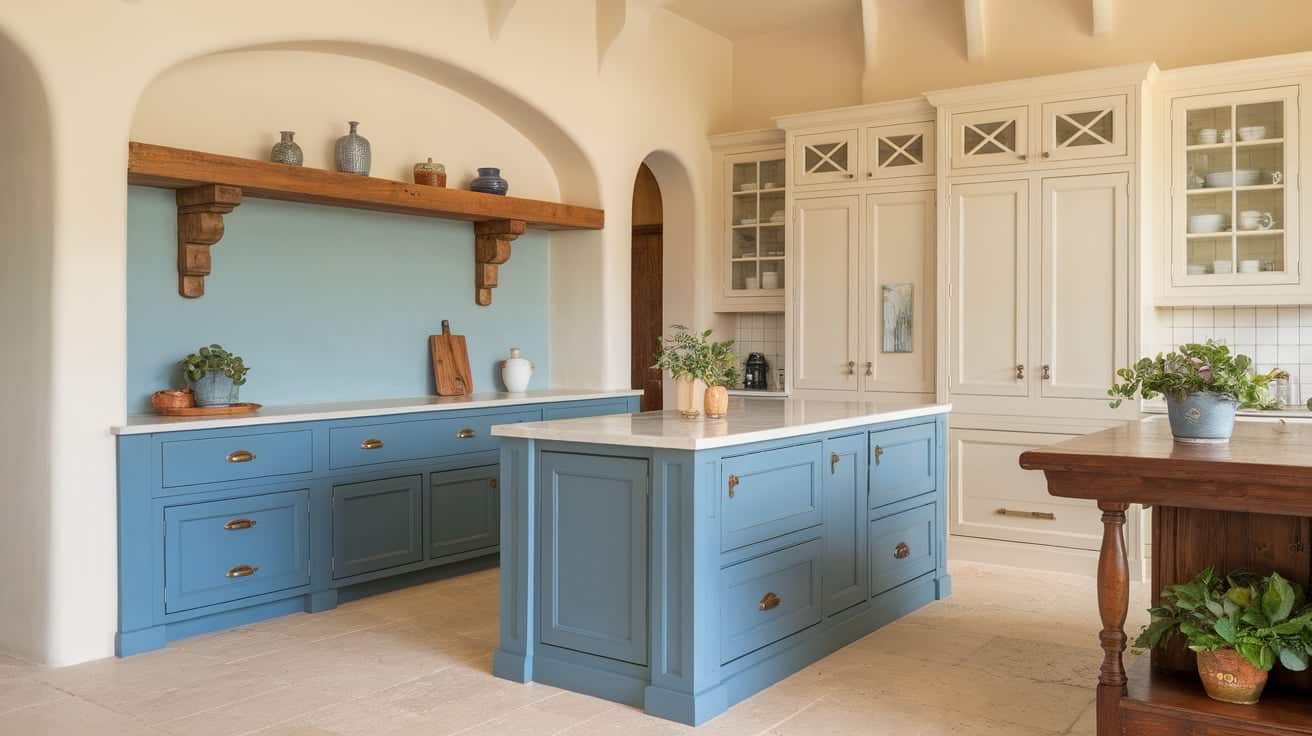
Cream and blue cabinets provide contrast without sharp edges. Cream cabinets feel warmer than pure white and help soften the overall look.
Blue tones, especially muted or dusty shades, add depth without overpowering the space. This pairing works well in kitchens with natural light and neutral flooring.
Blue is often used on lower cabinets or islands, while cream stays on uppers to keep the room bright.
Wood accents and warm metal hardware help tie both colors together. This combination suits traditional and transitional kitchens where a softer color shift is preferred.
6. Beige and White Cabinet Combinations
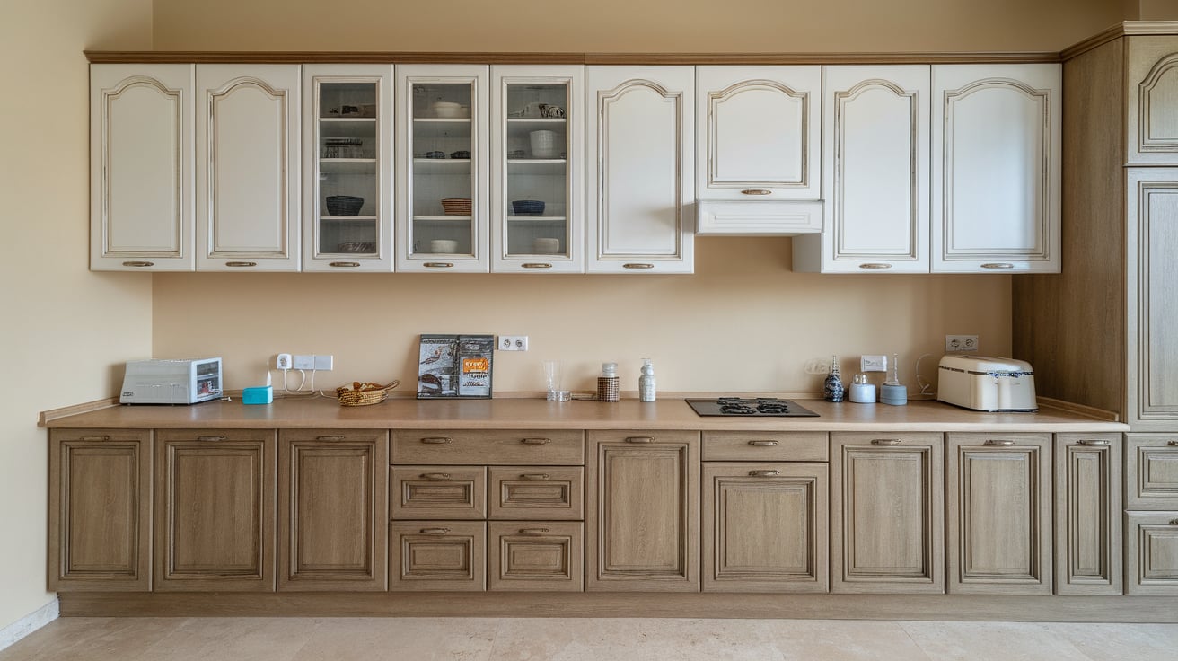
Beige and white cabinets create a subtle contrast that feels calm and balanced.
White cabinets help reflect light, while beige adds warmth and depth. This pairing works especially well in kitchens with warm floors or stone surfaces. Beige lowers can ground the space without feeling dark or heavy.
White uppers keep the kitchen open and prevent visual crowding. This combination is ideal for homeowners who want two-tone cabinets without a strong contrast.
Matching beige tones with backsplashes or wall paint helps keep the design consistent and avoids a washed-out look.
7. Green and White Two-Tone Cabinets
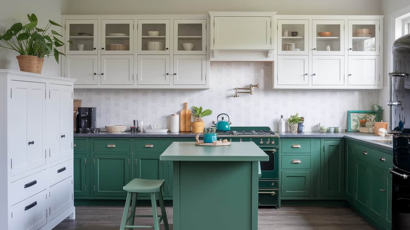
Green and white cabinets add color while staying easy on the eyes. White cabinets help keep the kitchen bright, while green adds personality and depth.
Soft greens work well in smaller kitchens, while deeper greens suit larger layouts with good lighting.
Green is commonly used on lower cabinets or islands to keep the upper space light. This combination pairs well with wood accents, stone counters, and neutral backsplashes.
Repeating green in small details like stools or plants helps the color feel intentional rather than random.
8. Taupe and White Kitchen Cabinets
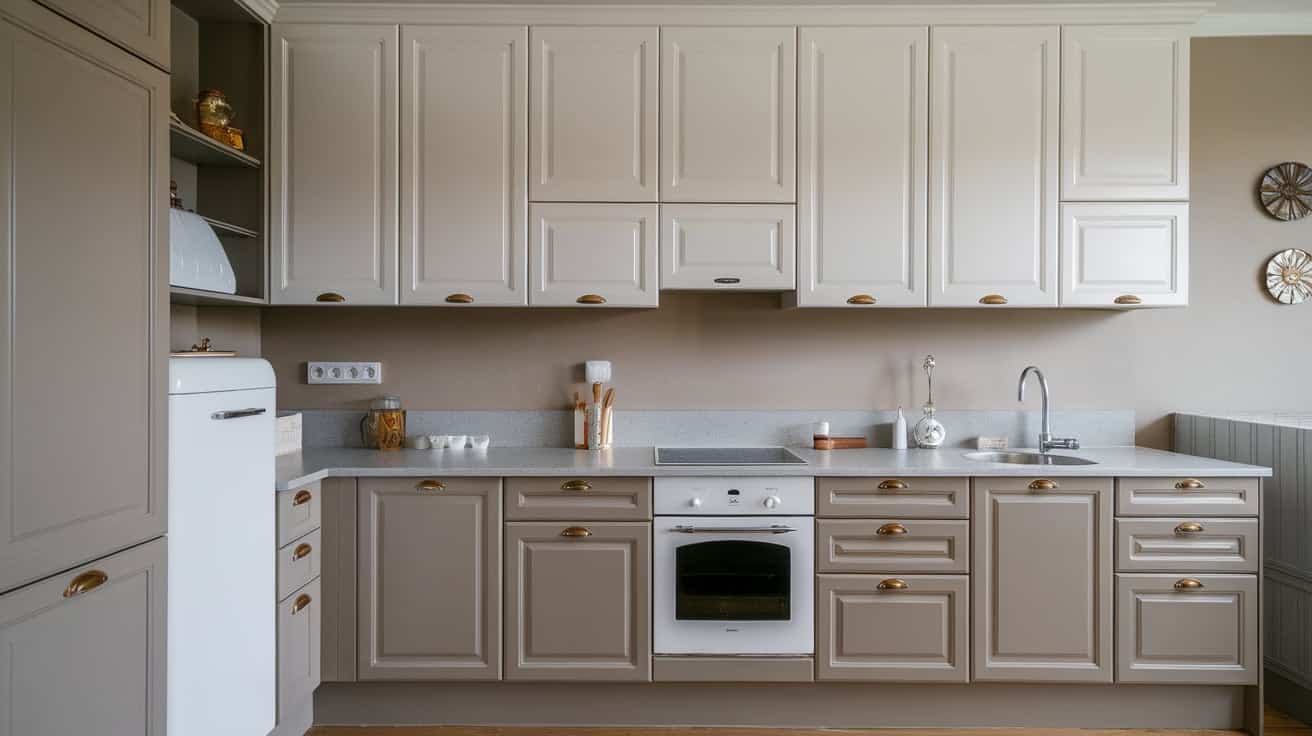
Taupe and white cabinets offer a neutral option with more warmth than gray.
White cabinets keep the kitchen light, while taupe adds softness and structure. This pairing works well in kitchens that need contrast without dark tones.
Taupe lowers help ground the space while staying flexible with other finishes. White uppers prevent the room from feeling flat or heavy. This combination pairs well with wood floors, stone counters, and simple hardware.
Taupe and white cabinets also allow easy updates through lighting or wall color changes later.
Two-Tone Kitchen Cabinet Ideas Using Wood
Mixing painted cabinets with wood finishes adds warmth and contrast while keeping the kitchen balanced, practical, and visually grounded without relying on bold paint colors.
9. Wood Lower Cabinets With White Uppers
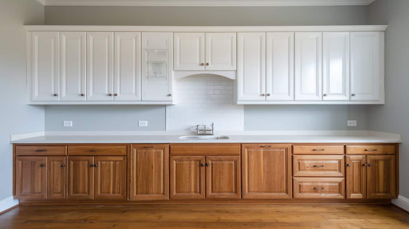
Wood lower cabinets paired with white uppers create a balanced and inviting kitchen layout. The wood base adds warmth and visual weight, which helps ground the space.
White upper cabinets reflect light and prevent the kitchen from feeling closed in. This setup works well in kitchens with limited natural light or lower ceilings.
Light to medium wood tones keep the look relaxed, while darker woods add a stronger base. White countertops and simple backsplashes help connect both finishes.
Repeating the wood tone in flooring or open shelving helps the kitchen feel connected and intentional.
10. Painted Cabinets With a Wood Kitchen Island
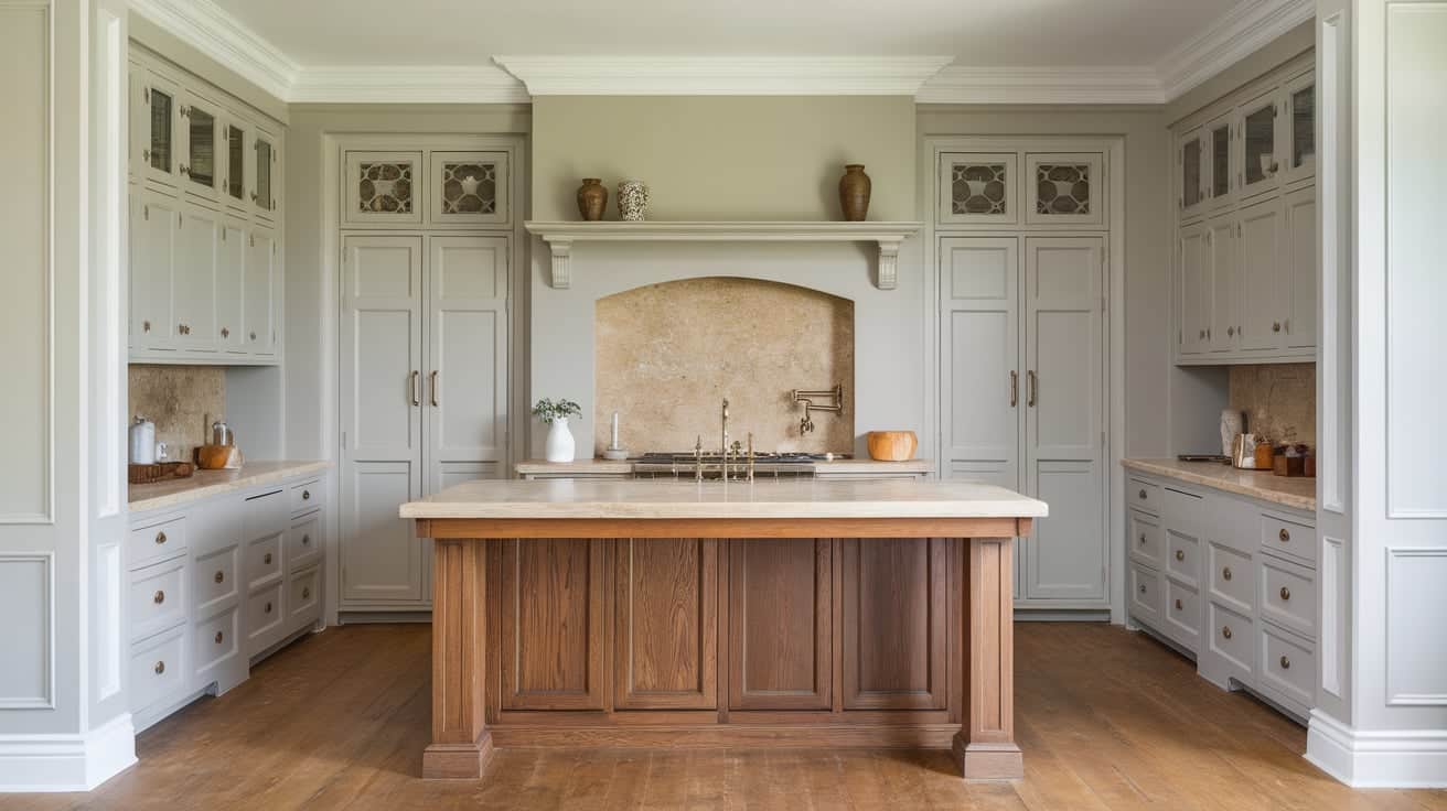
Using a wood kitchen island with painted cabinets creates a clear focal point without overwhelming the room.
Painted perimeter cabinets keep the kitchen clean and structured, while the wood island adds warmth at the center. This approach works well in open layouts where the island is highly visible.
The island can match wood floors or contrast slightly for depth. Painted cabinets in neutral tones help the wood stand out naturally. Keeping the island countertop simple allows the wood grain to remain the main feature without distraction.
11. Light Wood Cabinets With Dark Accents
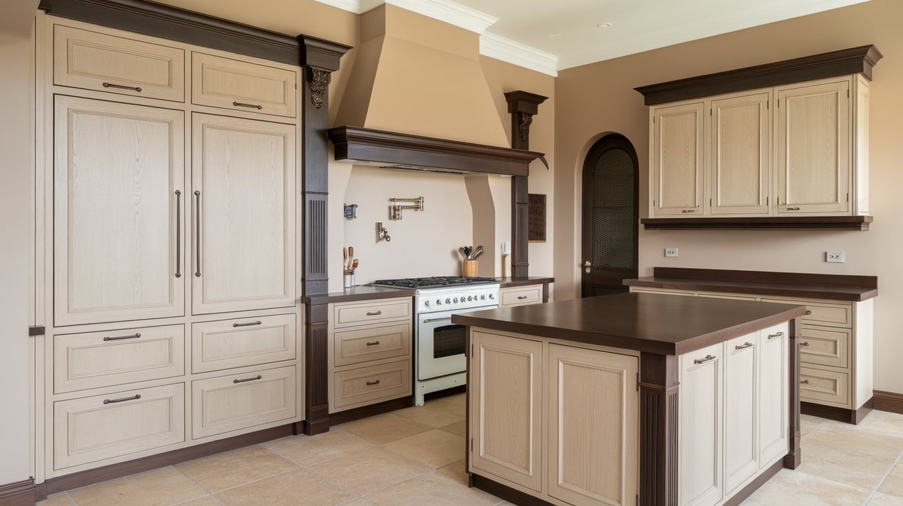
Light wood cabinets paired with darker accents create contrast without making the kitchen feel heavy.
The wood keeps the space open and warm, while dark accents add definition. These accents can appear on lower cabinets, islands, or trim details. This approach works best when darker colors are used in controlled areas rather than across all cabinetry.
Simple hardware in darker finishes helps tie the look together. Light countertops and walls help maintain balance and prevent the darker elements from taking over the space.
12. Wood Cabinets Paired With Soft Neutral Paint
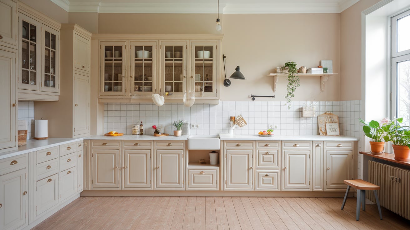
Pairing wood cabinets with soft neutral paint creates a calm and flexible kitchen design.
Wood adds warmth and texture, while neutral paint keeps the space light and easy to live with. This combination works well in kitchens that need a quiet, balanced look.
Soft paint colors can be used on upper cabinets or surrounding walls. The key is choosing neutrals that match the undertone of the wood. Simple backsplashes and countertops help keep the focus on the cabinet finishes without visual clutter.
13. Wood Cabinets With Painted Interior Shelves
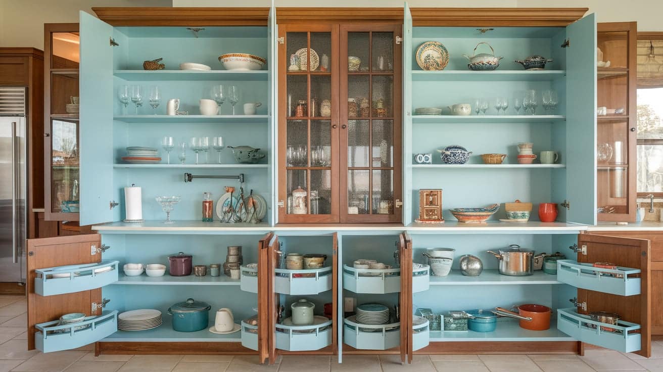
Painted interior shelves inside wood cabinets add subtle contrast without changing the exterior look. This idea works well for glass-front cabinets or open sections used for display.
The wood exterior keeps the kitchen grounded, while the painted interior adds interest when cabinets are open.
Light paint colors help items stand out without drawing too much attention. This approach suits kitchens that want detail without bold color changes.
Keeping the interior paint limited to select cabinets helps maintain a clean and consistent overall layout.
Two-Tone Kitchen Cabinet Ideas by Layout
Cabinet placement controls how contrast shows up in the kitchen, helping separate areas, manage light, and guide attention without relying only on color strength.
14. Kitchen Island in a Different Cabinet Color
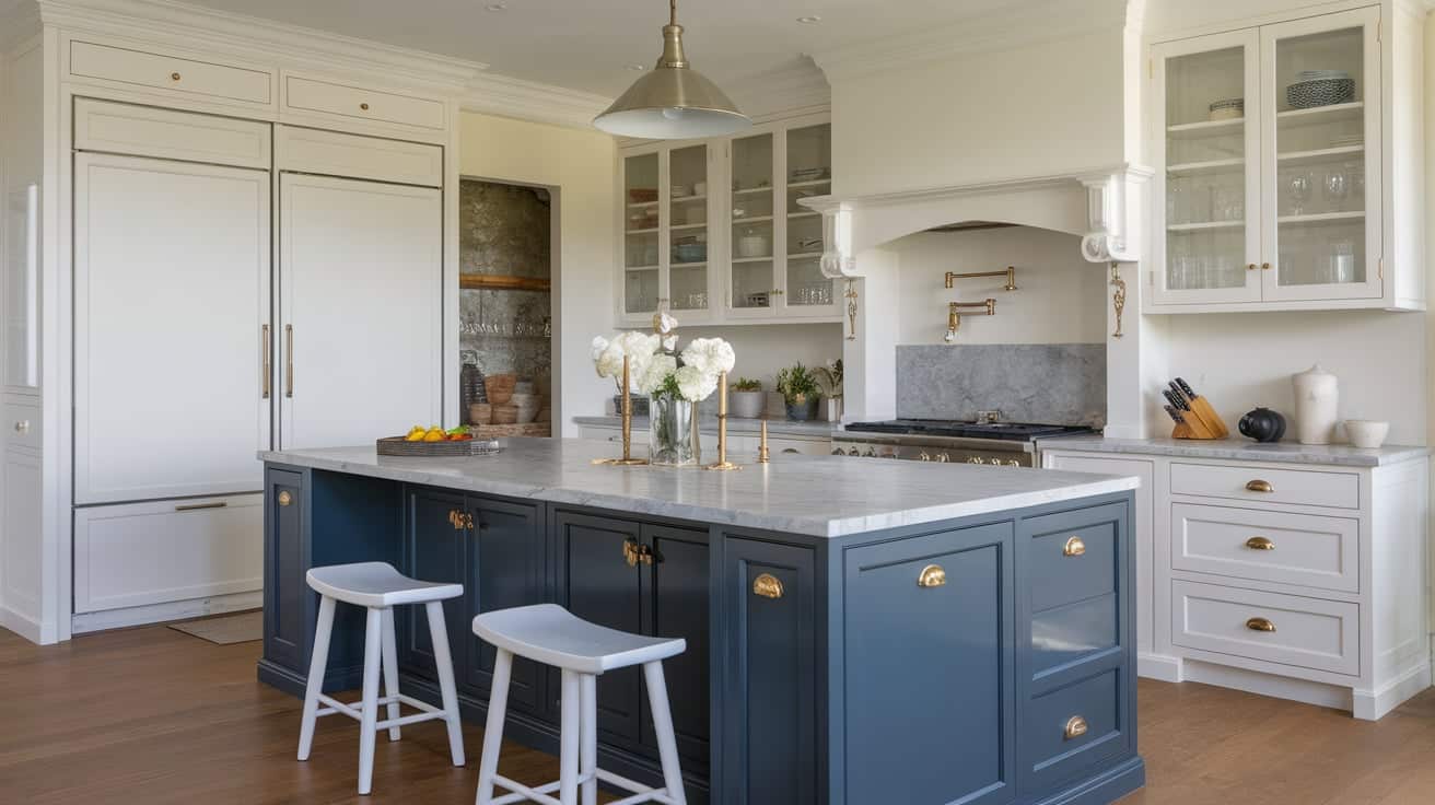
Using a different cabinet color on the kitchen island helps define it as a separate work zone. This layout works well in open kitchens where the island is visible from multiple angles.
Keeping perimeter cabinets neutral allows the island color to stand out naturally. Darker island colors help anchor the center of the room, while lighter tones can soften the look.
Matching the island color with small details like stools or lighting helps keep the design connected. This layout gives flexibility without changing all cabinets.
15. Two-Tone Upper and Lower Cabinets
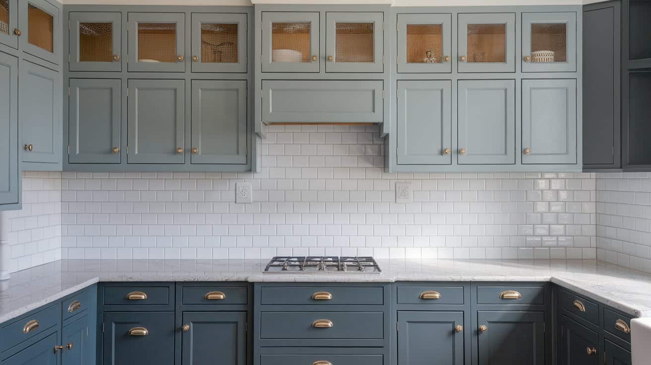
This layout uses one color for upper cabinets and another for lower cabinets.
Lighter colors on top help the kitchen feel open and less crowded. Darker colors on the bottom help ground the space and hide daily wear. This setup works well in kitchens of any size and fits many cabinet styles.
It also makes it easier to control contrast without adding extra elements. Keeping countertops and backsplashes simple helps both cabinet colors work together smoothly.
16. One Accent Wall of Cabinets in a Second Color
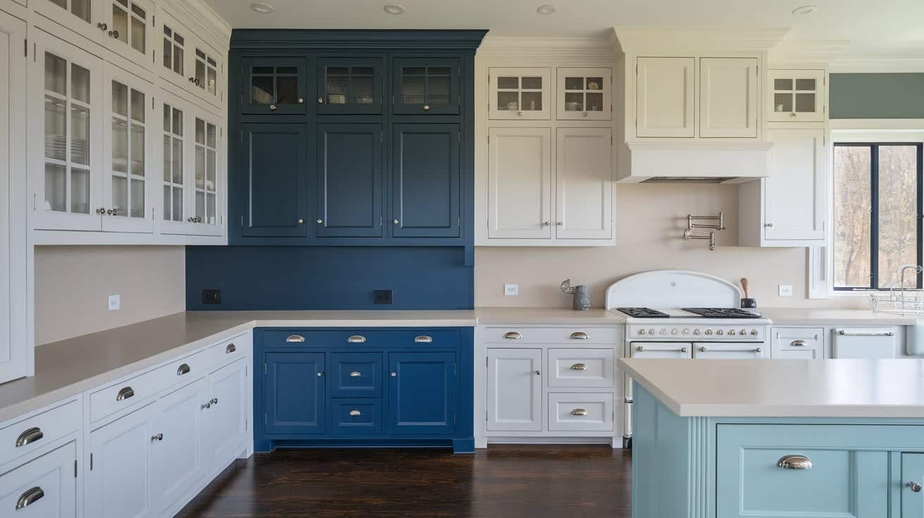
Using a second cabinet color on one wall creates contrast without spreading it across the entire kitchen. This approach works well in galley or L-shaped kitchens. The accent wall can highlight a cooking zone, pantry area, or built-in storage.
Keeping other cabinets neutral helps prevent the space from feeling busy. This layout allows stronger colors without overwhelming the room. Repeating the accent color in small details helps it feel planned and intentional.
17. Perimeter Cabinets vs. Statement Island
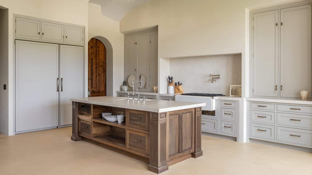
This layout keeps perimeter cabinets consistent while giving the island a stronger color or finish. It helps separate work areas without changing the full cabinet layout.
Neutral perimeter cabinets keep the kitchen feeling open and flexible. A darker or wood island adds weight and focus at the center.
This setup works well in larger kitchens where the island plays a major role. Simple countertops and clean cabinet lines help the contrast feel controlled and organized.
18. Small Kitchen Two-Tone Cabinet Layouts
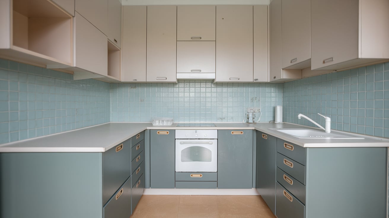
In small kitchens, layout matters more than strong color choices. Using light colors on upper cabinets helps the space feel open and less boxed in.
Darker lower cabinets can add contrast while keeping the room grounded. A small island in a darker tone can work if the rest of the cabinets stay light. Limiting the second color to one clear area prevents the kitchen from feeling busy.
Simple cabinet styles help the eye move easily through the space. Minimal hardware also reduces visual clutter. When colors and placement are planned carefully, two-tone cabinets can still look clean, balanced, and practical in compact kitchens.
Innovative Two-Tone Cabinet Design Ideas
These ideas use finish changes, placement details, and subtle contrast to create interest, giving you options beyond standard color splits while keeping the kitchen clean and well planned.
19. Matte and Gloss Finish Two-Tone Cabinets
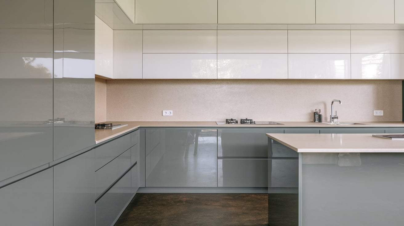
Using two finishes instead of two colors adds contrast in a quiet way. Matte cabinets absorb light and feel solid, while glossy cabinets reflect light and feel lighter. This works well when both finishes share the same color family.
For example, matte lowers with glossy uppers keep the space balanced without sharp contrast. This approach suits modern kitchens with simple cabinet shapes.
Keep countertops and backsplashes neutral so the finish change stays noticeable. Limiting the glossy finish to upper cabinets or islands helps prevent glare and keeps the kitchen comfortable to use every day.
20. Two-Tone Cabinets With Open Shelving
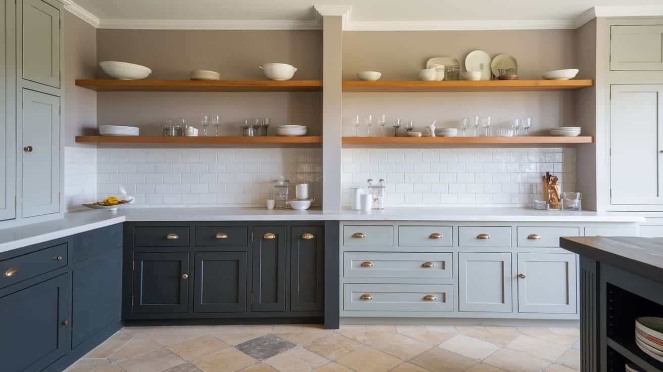
Open shelving can replace some upper cabinets to create a clear break between tones. Painted lower cabinets provide structure, while shelves add lightness above.
Wood shelves work especially well when paired with painted cabinets for warmth. This layout helps smaller kitchens feel less boxed in. Shelves should be limited to one section to avoid clutter.
Using the same color on shelves and nearby trim helps keep the look organized. This approach works best when shelves are styled simply and used for everyday items rather than heavy storage.
21. Dark Cabinets With Matching Hood or Trim
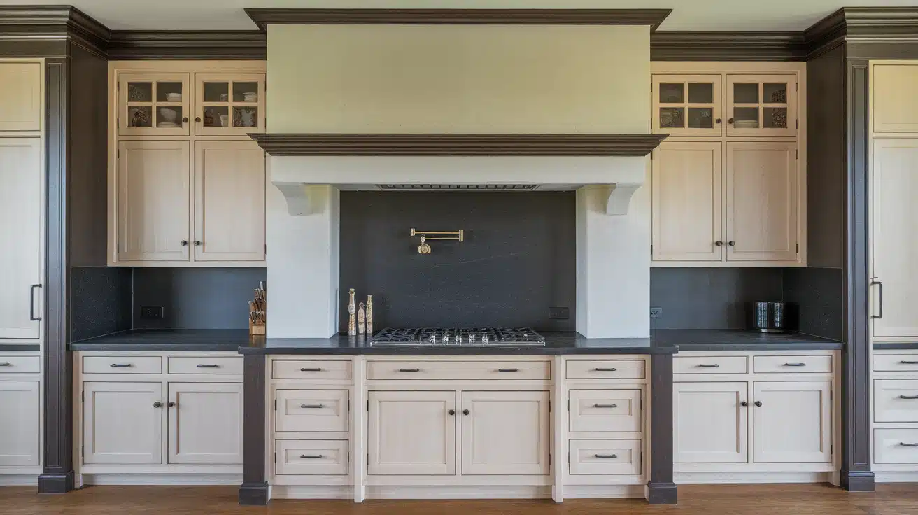
Repeating a dark cabinet color on the range hood or trim helps the design feel intentional.
Instead of the dark tone stopping at cabinet edges, it continues across another surface. This creates a strong visual anchor without adding more colors.
The rest of the cabinets should stay light to maintain balance. This idea works well in kitchens with a focal cooking area. Keeping the hood shape simple prevents the darker color from feeling overpowering.
Matching trim or toe kicks can further support the look without crowding the space.
22. Two-Tone Cabinets Using Hardware Contrast
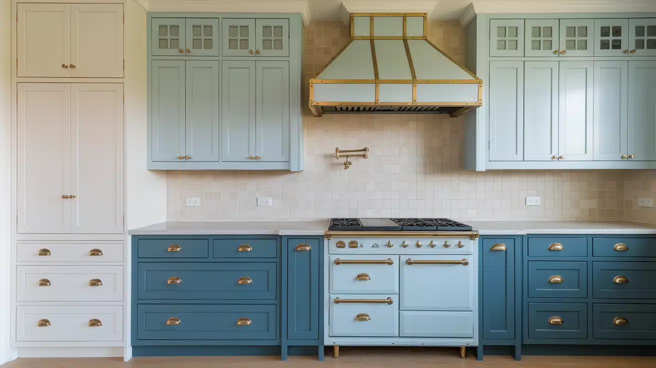
Hardware can play a key role in two-tone cabinet designs. One cabinet color paired with different hardware finishes creates separation without changing paint.
For example, lighter cabinets with darker pulls can sit next to darker cabinets with lighter hardware.
This keeps contrast controlled and subtle. Hardware should repeat across the kitchen so the look stays consistent. This idea works well for people who want variety without repainting.
Simple cabinet shapes help hardware stand out without competing with other design elements.
23. Subtle Two-Tone Cabinets Using Close Neutrals
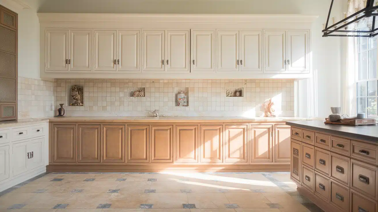
Using two close neutral shades creates contrast that feels calm and understated.
For example, soft white paired with warm off-white adds separation without sharp lines. This approach works well in kitchens that already have texture from counters or flooring.
Close neutrals help cabinets stand apart while still feeling connected. This idea suits smaller kitchens where a strong contrast may feel too bold. Careful lighting selection helps show the difference between tones.
Keeping finishes consistent helps the colors read clearly without confusion.
How to Choose the Right Two-Tone Kitchen Cabinet Idea
Choosing the proper two-tone cabinet setup depends on balance, lighting, and how each surface works together in your kitchen layout.
Pick which element should stand out: Decide whether the island, lower cabinets, or a single wall should carry the stronger color.
Match cabinets with counters and backsplash: Make sure cabinet colors work with countertop tones and backsplash patterns to avoid visual conflict.
Test paint and wood samples in your lighting: Check samples at different times of day to see how natural and artificial light affects the colors.
Common Two-Tone Cabinet Mistakes to Avoid
Avoiding a few common mistakes helps two-tone cabinets look balanced, clear, and intentional instead of busy or mismatched.
- Too much contrast: Strong color differences can overwhelm the space if not balanced with light surfaces.
- Ignoring ceiling height: Dark upper cabinets can make ceilings feel lower, and the kitchen feel cramped.
- Mixing clashing undertones: Warm and cool tones that do not align can make cabinets feel disconnected.
Conclusion
We covered how color combinations, wood finishes, and layout choices all affect how two-tone cabinets look and feel in real kitchens.
When planned well, this approach helps balance light, add contrast, and break up long cabinet runs without making the space feel busy. I’ve found that focusing on one standout area, like lowers or an island, makes decisions much easier.
If you take one thing away, let it be this: placement matters just as much as color. Two-tone kitchen cabinet ideas work best when every surface supports the overall flow.
Which option fits your kitchen best? If you want more help, take a look at the related cabinet and kitchen design blogs next.