Terrazzo never really went away. It just keeps coming back louder. The chips have grown, the palettes have warmed, and a surface that used to say municipal foyer or 1960s bank lobby now turns up on a Milan stand as the plinth under one sculptural chair. Stone scattered through a smooth ground was always a likable look. What changed is how many ways a designer can now lay it without signing up for the labor it used to demand.
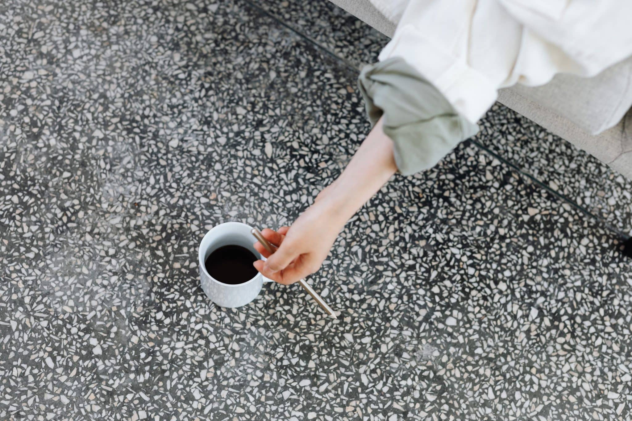
Start with why it works at all. Terrazzo is one of the rare floors that reads as pattern and as calm in the same glance. Your eye catches the flecks, then settles back into the color holding them. A fine graniglia in warm greys can read as a plain floor from the far side of a room and only give up its detail up close.
Push the mix the other way, with marble chips the size of a coin set in a saturated base, and it becomes the loudest thing in the space while quietening everything else down. One material can do both of those jobs. That range, from near-neutral texture to graphic statement, is why it outlasts every revival.
What Poured Terrazzo Actually Costs You
The traditional version has genuine depth behind it. Poured terrazzo and its precast cousin graniglia, the cement-bound tile still pressed by hand in workshops like Huguet in Mallorca, hold a quality that a printed surface struggles to match. Light travels only so far into real stone. After grinding and honing, the chips sit at slightly different heights, so the floor keeps a faint topography that a photograph flattens out. For a hero floor in a hotel bar, or a one-off basin surround, nothing else feels quite the same.
You pay for that in time as well as money. A poured floor goes down wet, cures, then gets ground and polished in place, which keeps a room out of commission far longer than tiling ever would. The cement is porous, so it wants sealing on day one and resealing on a schedule after that, and an acid spill on a bare patch will etch it.
None of this rules out the real thing where budget and program can carry it. It just means being straight with the client about the up-front cost, the cure time, the sealing and the ongoing upkeep before anyone orders the first bag of aggregate.
Getting the Finish Right on A Working Floor

Porcelain that prints the chip pattern onto a glazed body skips the two things poured terrazzo asks for. The fleck and color variation convince once they are down, yet the surface never needs sealing and cleans with mild detergent. For a floor that has to take a busy hallway or a wet bathroom, audition terrazzo-look porcelain in a range of chip styles before you commit to a poured slab.
From there, the choices run much as they would with real stone. Fine, subtle flecks read calm underfoot. Larger, more expressive chips can carry a feature wall or a floor on their own, and a matte finish stops a large-format tile from turning glossy and slick. Australian retailer Cheap Tiles Online groups these by look, so you can hold a neutral speckle against a bold high-contrast chip in the same matte floor format and pick between them properly.
Finish is worth slowing down on. A polished terrazzo-effect tile throws light back and reads richer in a low-traffic spot, say a powder room or a retail feature wall, but it shows every water mark and turns treacherous the second a bathroom floor gets wet. Matte trades the sheen for grip.
It softens the flecks a touch, hides drips and dust between cleans, and holds underfoot, which is why it usually wins wherever people actually walk, from an entry hallway through to a bathroom floor. Honed splits the difference: a low sheen that suits living areas where a dead-flat matte can feel a little dry.
Where Neutral Belongs, and Where Bold Does
Neutral and bold ask for different treatment, and running them as one blanket trend does a room no favors. A soft, close-toned terrazzo, say cream chips in an oatmeal base, behaves almost like a textured plain floor.
It opens up a small bathroom, sits quietly under strong joinery and lets a coloured vanity or a piece of art carry the room. That is the safe call for a whole-floor run, because the pattern never fights whatever you put on top of it.
Bold terrazzo wants the opposite. A deep green or terracotta base scattered with contrasting marble chips is there to be seen, so keep it to a defined patch rather than wall to wall. A splashback works, or a shower niche, or the floor of a compact cloakroom where a bit of drama earns its place.
Run that same tile across an open-plan living floor, and it starts to feel restless. Chip scale matters as much as color here. Big chips read as pattern from standing height and reward a large, uninterrupted plane. A finer fleck copes better in a busy layout, where furniture and rugs keep breaking the line of sight anyway.
When Porcelain Is the Right Call, and When It Is Not
There is an honest limit worth naming. A printed surface does not carry the light-into-stone depth of the poured original, and a designer chasing that specific quality, or the slightly uneven honed hand of a genuine graniglia tile, will notice in the right light. For a signature installation where the floor is the whole point, real terrazzo still wins.
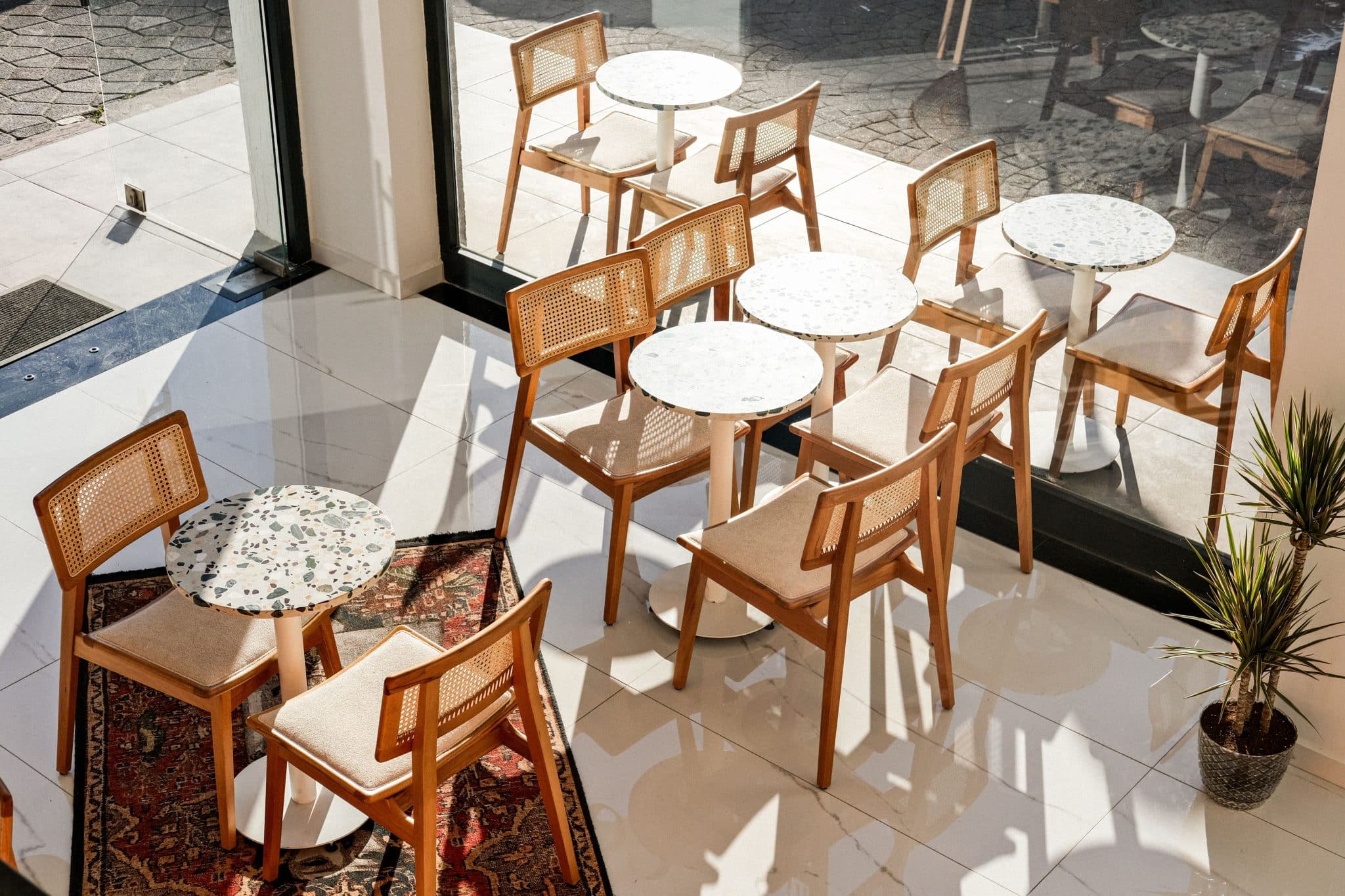
For most floors that just have to work, that gap disappears the moment the furniture goes in. Think of the rooms that get hammered: a family bathroom, a rental refit turned around on a budget, a café floor mopped every night and drowned in spilled coffee, a laundry, an entry that takes wet shoes all winter.
These want a surface that shrugs off stains, needs no seal, and comes clean with a mop. Porcelain delivers the terrazzo look in exactly those rooms, and nothing stops real terrazzo from taking the hero moment in the same scheme while porcelain does the running everywhere the client will actually have to maintain.
The way to brief it is simple enough. Treat it as a floor tile first and a pattern second, check the slip rating for wet areas, and go matte for anything walked on. Save the bold speckle for the spots that can carry it, and let a quiet neutral handle the long stretches. Do that, and the look that has already survived every revival stays easy to live with, whatever the next trend cycle does.