Modern interiors are often associated with clean lines, restrained palettes and carefully edited details. That can make the idea of contrasting door handles seem risky. Why introduce a bold brass lever, a black knurled pull or a polished chrome feature when everything else is deliberately calm?
Yet contrast, used thoughtfully, is often what stops a contemporary space from feeling flat. Door furniture may be small in scale, but it is handled every day and appears repeatedly throughout a home. It has a surprising influence on how a room feels: refined or industrial, warm or crisp, understated or expressive.
The question is not whether contrasting handles work in a modern interior. They can. The more useful question is how much contrast the space can support without losing the visual clarity that makes modern design so appealing.
Why Contrast Belongs in Contemporary Design
Modern design is not necessarily monochrome. At its best, it balances simplicity with material interest. Think of a pale oak kitchen with dark shadow gaps, a white plaster wall beside a black-framed window, or a smooth stone worktop paired with textured timber cabinetry. These contrasts create depth while preserving an overall sense of order.
Door handles can perform the same role. A dark handle on a light-painted door gives the opening a clear outline and creates a point of definition along an otherwise plain wall. Warm-toned brass against cool grey or deep green introduces a little visual warmth. Even a subtle difference in sheen — such as satin nickel on a matt door — can make a space feel more considered.
The important distinction is between contrast and randomness. A modern home can accommodate a strong material or colour shift, but it needs a reason to be there. The handles should relate to something else in the scheme: lighting, tapware, window frames, furniture legs, shelving brackets or artwork frames.
When selecting premium door furniture, it is worth considering it as part of that wider material language rather than as a final, isolated purchase. The most successful choices tend to echo an existing finish or deliberately introduce one that appears elsewhere often enough to feel intentional.
Choosing the Right Type of Contrast
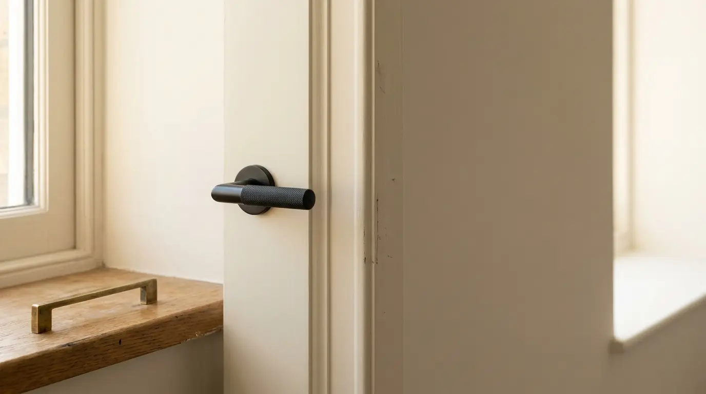
Contrast does not always mean black against white. It can be created through colour, temperature, texture, shape or finish. Understanding which type suits the room helps avoid an overly busy result.
Colour and Temperature
Black handles are a familiar modern choice because they create clear graphic definition. They work particularly well with white, soft grey, warm neutrals and natural wood. In a home with black window frames or dark lighting fittings, they can provide a strong visual thread from room to room.
Brass, bronze and copper-toned finishes offer a different kind of contrast. Rather than reading as sharp or architectural, they tend to introduce warmth. A muted or aged brass handle can soften minimalist joinery, while a brighter polished finish is more suited to spaces with a confident, tailored look.
Cool metals such as chrome, stainless steel and satin nickel are often quieter. They can still contrast against dark paint or richly grained timber, but their effect is generally more restrained.
Texture and Form
A handle’s texture can matter as much as its colour. Knurled, hammered or ribbed surfaces add tactility, which can be especially useful in interiors dominated by smooth plaster, glass and lacquered cabinetry. However, one textured finish usually goes further than several competing ones.
Shape should also reflect the wider design vocabulary. A slim, squared lever suits crisp contemporary joinery. A softer curved handle can offset the angularity of a modern kitchen or corridor. The handle does not have to match every line in the house, but it should not feel as though it belongs to another era entirely.
Use Repetition to Make a Bold Choice Feel Calm
A contrasting handle becomes convincing through repetition. One black handle on a single door may feel accidental; the same finish across internal doors, cupboard pulls and perhaps a stair balustrade detail feels like a design decision.
That does not mean every piece of hardware must match exactly. In fact, overly uniform finishes can make a home feel staged. A better approach is to establish a dominant finish, then allow related elements to vary slightly in scale or sheen.
A practical way to test the balance is to identify three touchpoints before committing:
- Door handles and hinges
- Cabinet pulls or kitchen hardware
- Lighting, taps, window frames or furniture accents
If the chosen finish appears in at least two of these areas, it will usually feel grounded. If it appears nowhere else, it may still work, but should be treated as a purposeful feature rather than a background detail.
Consider the Door Before the Handle
The door itself determines how dramatic the contrast will appear. A black lever on a flat white door is assertive because there is little else competing for attention. The same handle on a dark oak veneered door may be almost understated.
Paint colour matters too. Deep navy, charcoal, olive and terracotta doors can carry metallic finishes beautifully, but the undertones need attention. Yellow-toned brass can look rich against warm greens and reds, while brushed nickel may sit more naturally with cooler blues and greys.
Scale is another common stumbling block. Large backplates or oversized handles can overwhelm narrow doors, particularly in compact apartments. Conversely, very small hardware may disappear on tall, wide doors. Before ordering, consider the door’s proportions and how the handle will be viewed from the hallway or adjacent room.
Keep Function at the Centre of the Decision
Door furniture is not simply decorative. It must feel good in the hand, work smoothly and suit the door’s use. A striking handle on a bathroom door should still be comfortable, easy to clean and paired with an appropriate privacy mechanism. In high-traffic family spaces, highly polished finishes may show fingerprints more readily than brushed or aged alternatives.
It is also worth checking compatibility early. Lever handles, latches, locks, hinges and door thickness all need to work together. This is especially important in renovation projects, where existing doors may have pre-drilled holes or non-standard dimensions.
Contrasting door handles can absolutely work in a modern interior. Done well, they add rhythm, tactility and a sense of authorship to spaces that might otherwise feel overly uniform. The key is not to make every doorway shout. Choose one clear material direction, repeat it with restraint, and let the contrast sharpen the architecture rather than compete with it.