Your walls look great. Your furniture, too. So why does something still feel off? Sometimes the smallest thing throws a room out of balance, and nine times out of ten, it’s the door nobody paid attention to.
Then one afternoon, I picked up a can of warm charcoal paint and gave my bedroom door a fresh coat; the entire room felt different within hours.
That one small change showed me how much interior door color can shift the energy of a space. A single coat of paint can make a room feel bolder, calmer, or more pulled together without touching a single wall.
I’ve rounded up the best shades, from deep moody tones to soft pastels, along with practical tips on lighting, room size, and function. Ready to pick your shade? Let’s get into it.
Choosing the Perfect Interior Door Color
Before you get lost in the sea of door color choices, picking the right shade upfront can save you from future headaches. Here are some key things to think about:
- Consider Your Room’s Function & Style: Determine the vibe you want to create. Soft tones work for calm spaces like bedrooms, while bold shades suit entryways and living rooms.
- Think About Lighting: Lighting impacts color perception. Dark doors look great in well-lit rooms, while light colors brighten small, dim spaces.
- Account for Room Size: Darker colors can make large rooms feel cozier, whereas light colors can make smaller rooms feel more spacious.
- Match the Door Color to the Room’s Theme: Choose a door color that complements your room’s decor. For example, warm tones work with rustic themes, while cooler shades fit modern styles.
Choosing the right interior door color is a simple yet powerful design decision that refines balance, flow, and personality across every room in your home.
Interior Door Color Ideas That Change How a Room Feels
From deep moody tones to warm pastels, these door color ideas will help you reshape every room in your home, reflecting your personal style and uplifting your space into something uniquely yours.
1. Plum for a Rich and Artistic Statement
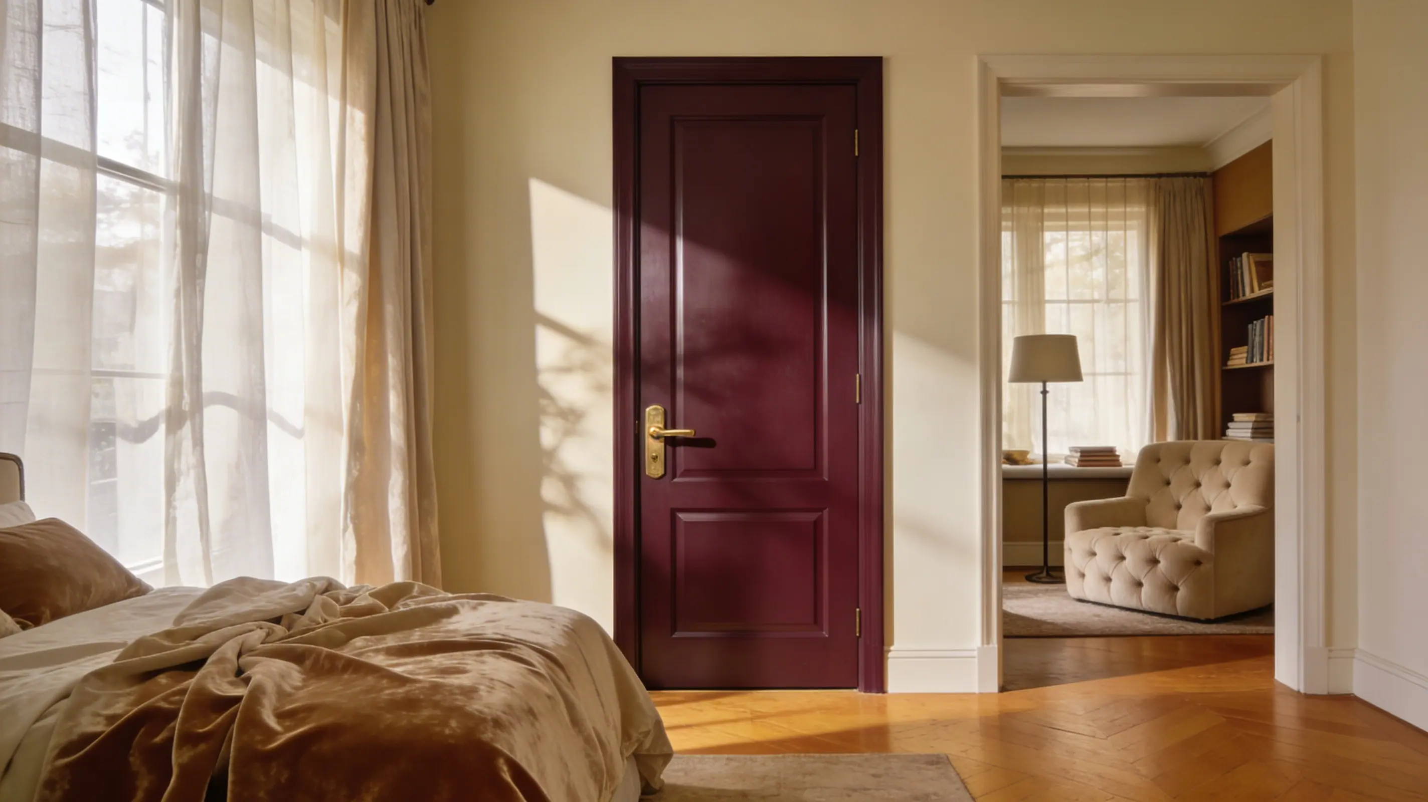
Plum doors make a rich, jewel-toned impression, carrying a sense of artistic luxury in bedrooms and creative spaces.
- Recommended Finish: Satin for a deep, smooth, and long-lasting color payoff on the door surface
- Pairs Well With: Gold hardware, warm cream walls, and rich velvet or linen textures complement plum well
- Where to Use: Bedrooms and creative studios are where plum doors deliver the most drama
A bold, deeply personal color pick that adds real sophistication, personality, and a commanding artistic presence to every room it occupies.
Tip: Plum is a reading-nook door. Use it in rooms meant for quiet indulgence and set a warm, creative mood before you even step inside.
2. Jade Green for a Polished and Gem-Inspired Look
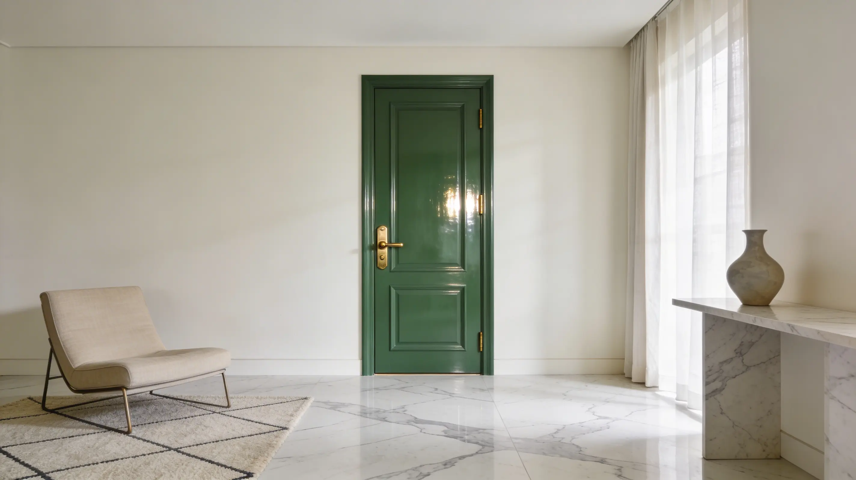
Jade green doors make a polished, gem-inspired impression, carrying a fresh elegance in living rooms and bathrooms.
- Recommended Finish: Semi-gloss for a rich, vivid, and very easy-to-clean surface result
- Pairs Well With: Brass hardware, cream or off-white walls, and natural stone or marble complements jade green well
- Where to Use: Living rooms and bathrooms are where jade green doors deliver the most refinement.
A confident, high-impact color pick that adds real freshness, personality, and a quietly luxurious presence to every room it occupies.
Tip: Jade green works best when the room steps back and lets it lead. Keep the walls quiet, the furniture simple, and the hardware warm, and the door will do everything it needs to do completely on its own.
3. Warm Caramel for a Cozy and Grounded Feel
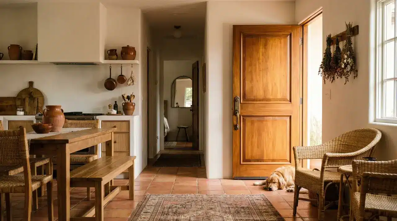
Warm caramel doors make a toasty, grounded impression, carrying a natural sense of comfort in kitchens and hallways.
- Recommended Finish: Satin for a warm, smooth, and richly textured surface result on the door
- Pairs Well With: Terracotta floors, warm white walls, and natural wood or rattan furniture complement caramel well
- Where to Use: Kitchens and hallways are where warm caramel doors deliver the most welcoming energy.
A nurturing, deeply warm color pick that adds real coziness, personality, and an earthy, grounded presence to every room it occupies.
Tip: Caramel comes alive around texture. Pair it with linen, wood, and clay nearby, and the whole space starts to feel genuinely lived-in, the kind of warmth that takes no effort to create but stays with you every single day.
4. Dusty Berry Pink for a Romantic and Vintage Charm
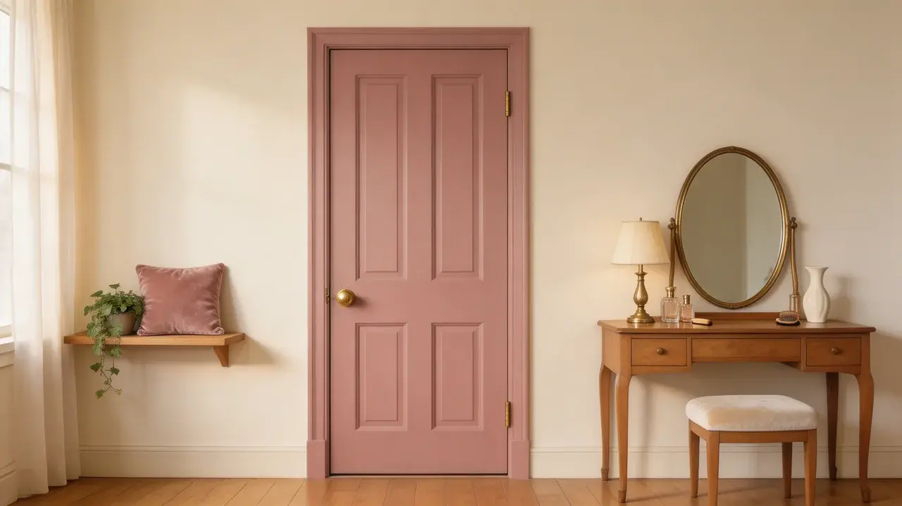
Dusty berry-pink doors make a sophisticated, romantic impression, bringing a vintage elegance to bedrooms and dressing rooms.
- Recommended Finish: Eggshell for a soft, low-sheen, and beautifully muted surface appearance throughout
- Pairs Well With: Antique brass fixtures, ivory walls, and warm wood or velvet textures complement dusty berry pink well
- Where to Use: Bedrooms and dressing rooms are where dusty berry pink doors deliver the most charm
A quietly daring, grown-up color pick that adds real romance, personality, and a refined vintage presence to every room it occupies.
Tip: Dusty berry pink belongs in spaces made for slowing down. It feels personal and intentional in every setting it touches, the kind of color you choose on purpose and never once regret.
5. Metallic & Pearl Effect Doors for a Luxury Finish
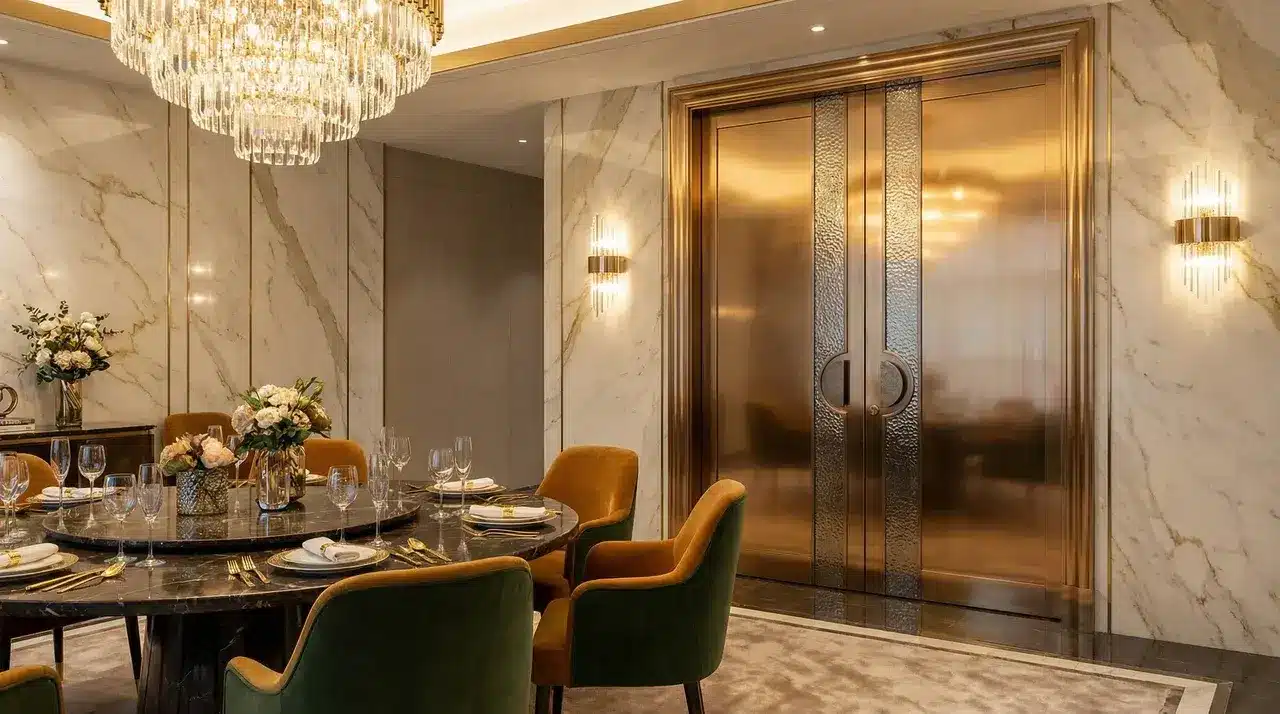
Metallic door finishes bring a rich, high-end quality and a genuinely distinctive, luxurious presence to any well-considered room.
- Metallic Shades: Bronze, champagne gold, and pewter are the top choices for this look.
- Finish: Metallic paints sealed with a durable protective clear coat for lasting shine
- Where to Use: Dining rooms and powder rooms are the ideal settings for this rich finish
These premium finishes give interior doors a genuinely polished, upscale appearance that standard paint cannot replicate.
Tip: Apply metallic paint in a single direction to avoid patchy, uneven shimmer. A foam roller works better than a brush here.
6. Sage Green for a Calm and Nature-Inspired Space
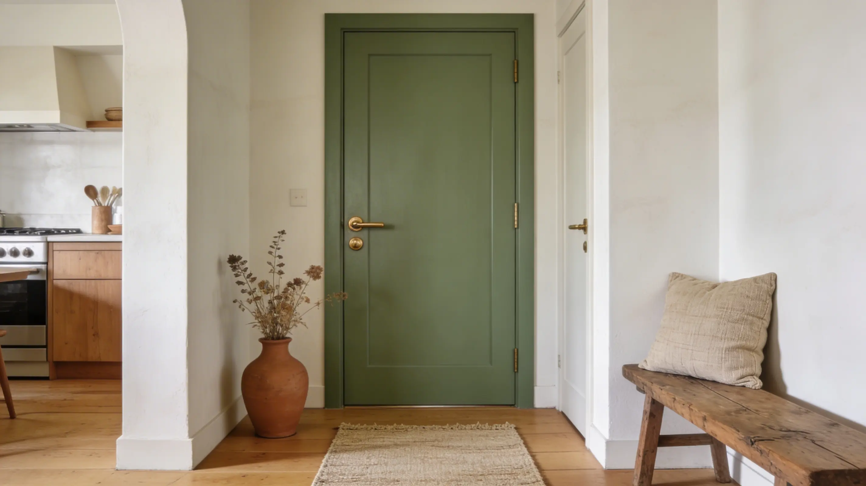
Sage green doors make a calm, organic impression, carrying a gentle natural energy in kitchens and hallways.
- Recommended Finish: Satin for a soft, rich, and beautifully lasting color on the door surface
- Pairs Well With: Warm whites, linen textiles, natural wood, and muted earthy tones complement sage green well.
- Where to Use: Kitchens and hallways are where sage green doors feel the most at home
A universally loved, quietly confident color pick that adds real calm, personality, and a grounded, natural presence to every room it occupies.
Tip: Sage green is the easiest yes in any room. It sits comfortably with almost every wall color and floor tone, so if you are ready to move past white or grey, this is exactly where to begin.
7. Classic Black Doors for a Lasting Look
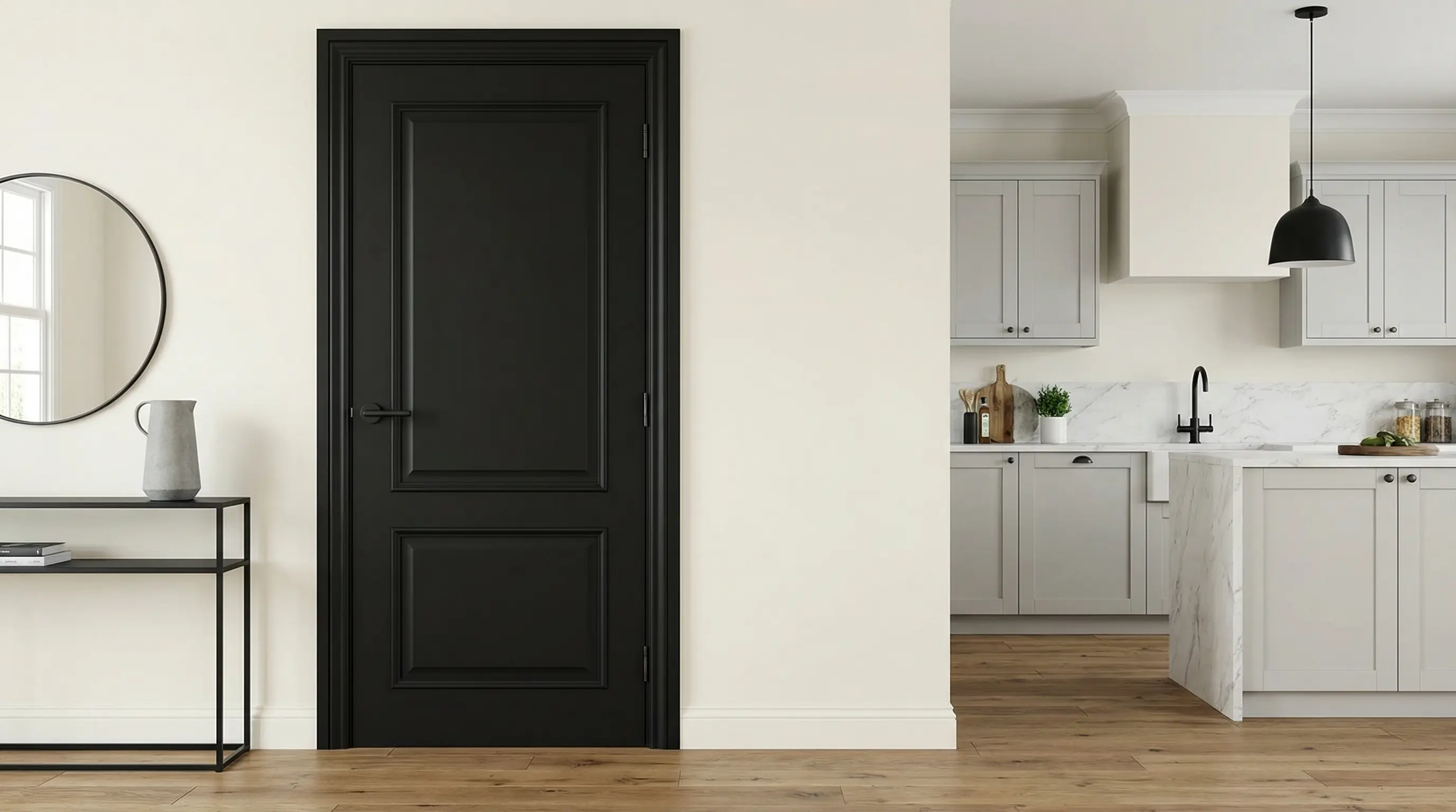
Black doors make a strong, lasting impression in any setting and work confidently across a wide range of design styles.
- Finish: Satin or semi-gloss provides a clean, sharp, and highly durable surface for black doors
- Color Pairing: Works best against white, cream, or light grey walls for maximum contrast and depth
- Where to Use: Entryways and kitchens are the most popular locations for classic black interior doors
Very few colors match black for sheer versatility, raw visual strength, and consistent relevance across interior design styles.
Tip: Black shows every fingerprint and dust speck. Keep a microfiber cloth handy and choose satin over high gloss for less upkeep.
8. White Doors for a Crisp, Clean Look
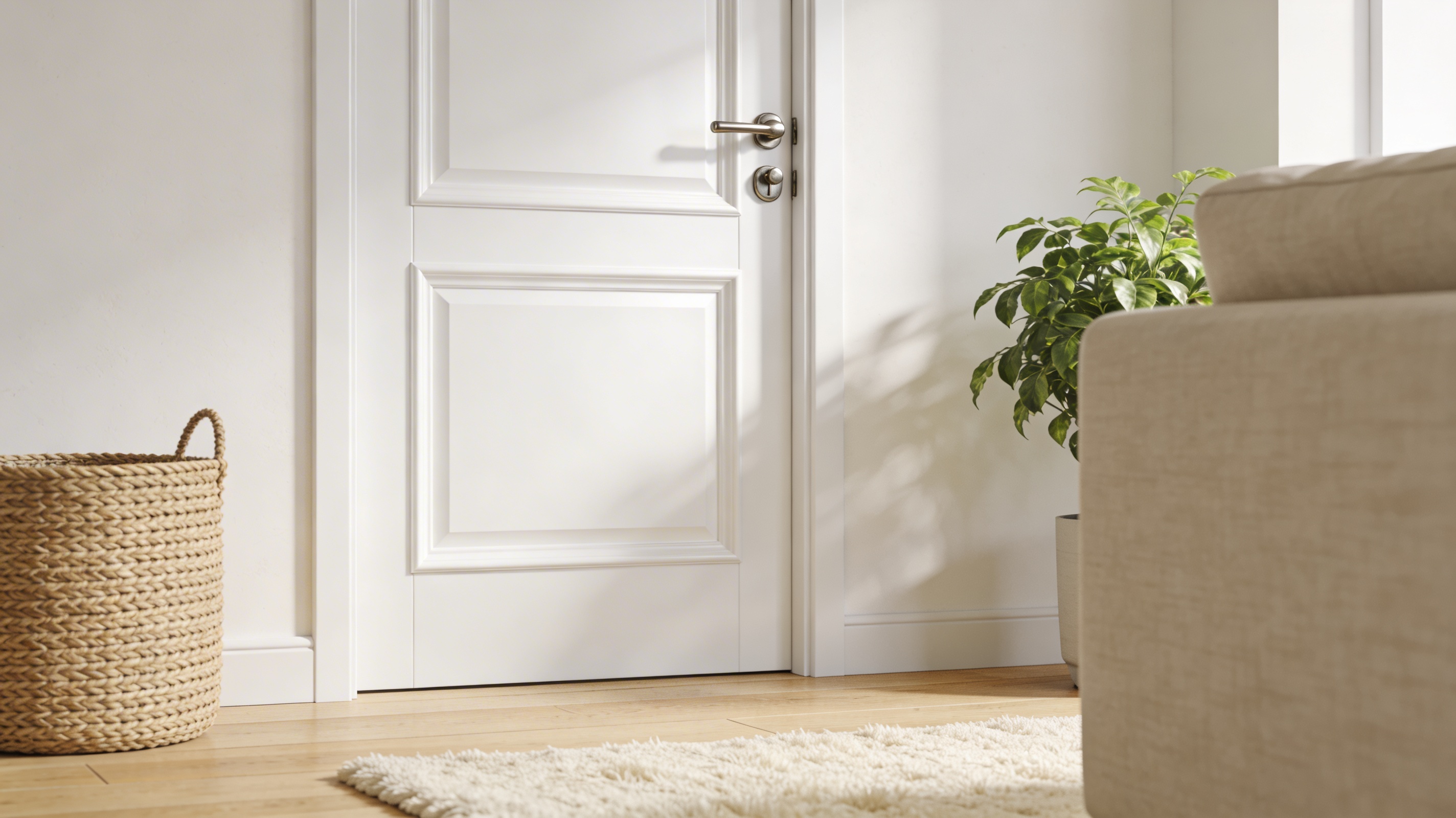
White doors keep any space looking consistently fresh, open, and well-put-together, regardless of the interior style surrounding them.
- Finish: Semi-gloss or satin for easy cleaning and a bright, long-lasting surface. Look
- Color Compatibility: White works well with virtually every wall color and flooring type available
- Where to Use: Living rooms and bathrooms are ideal settings for clean, white interior doors
A reliable, go-to color choice that never looks out of place and performs well in virtually any room, anywhere.
What I Feel Like: White doors are like a fresh white tee , they go with everything, feel effortless, and never go out of style. Simple comfort at its best.
9. Buttercream Yellow for a Gentle, Sun-Warmed Glow
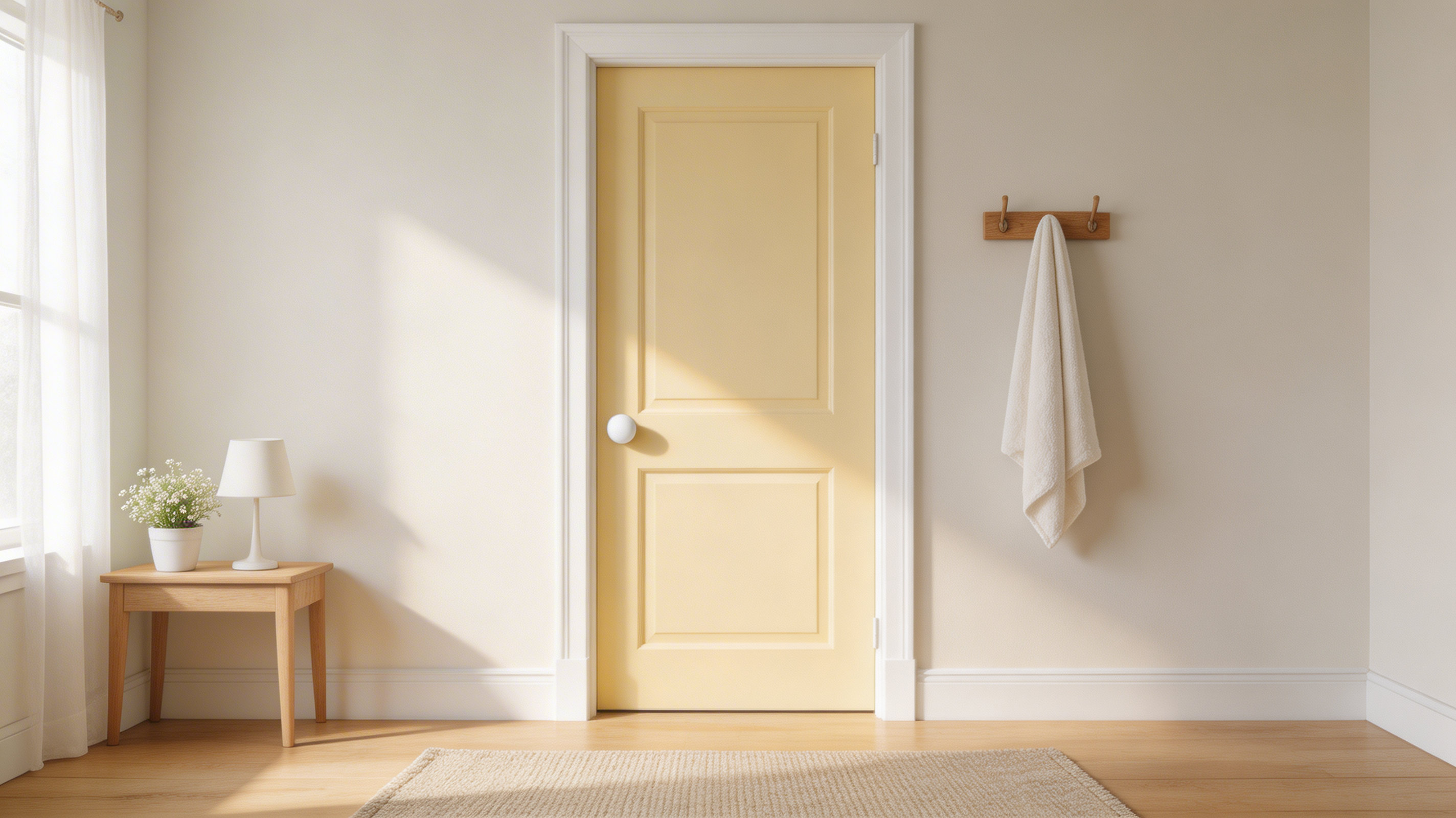
Buttercream yellow doors make a soft, sunlit impression, carrying a gentle and welcoming warmth in nurseries and hallways.
- Recommended Finish: Eggshell for a delicate, low-sheen, and warmly inviting surface appearance throughout
- Pairs Well With: White trim, natural wood tones, and soft ivory or warm grey walls complement buttercream yellow well
- Where to Use: Nurseries and hallways are where buttercream yellow doors deliver the most gentle, quietly cheerful warmth
A fearless, tenderly warm color pick that adds real softness, personality, and a quietly sunny welcoming presence to every room it occupies.
Tip: Buttercream yellow is a morning door. It works best where natural light hits early, a hallway or kitchen door in this shade feels like a small daily ritual of warmth.
10. Soft Peach for a Warm, Inviting Atmosphere
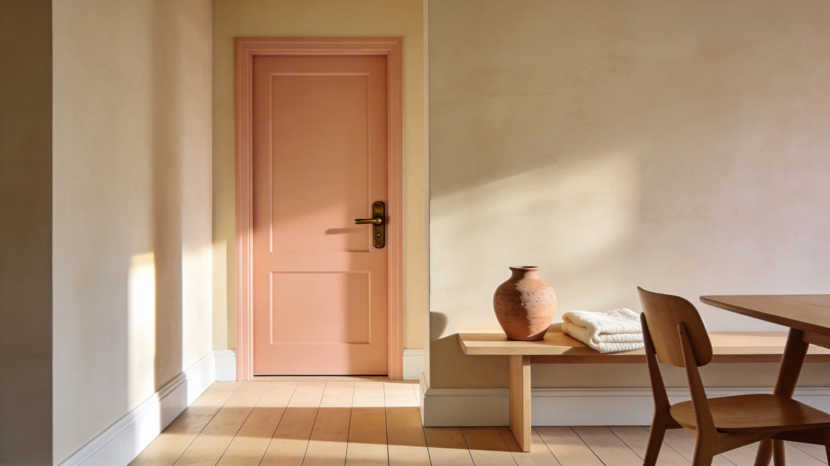
Soft peach doors introduce a gentle, sun-warmed quality to any interior without overpowering or competing with the existing color scheme.
- Finish: Eggshell for a soft, low-sheen, and subtle surface appearance throughout
- Pairs Well With: Cream, ivory, warm wood tones, and muted terracotta accents all work well
- Where to Use: Hallways and dining rooms take on a warm, welcoming quality with peach doors
An understated, warm choice that makes any space feel truly relaxed, personal, and genuinely welcoming from the very first glance.
What I Feel Like: Peach reminds me of golden-hour evenings at home. It’s the kind of warmth you feel, not just see. Effortlessly inviting.
11. Cool Teal for a Fresh, Lively Look
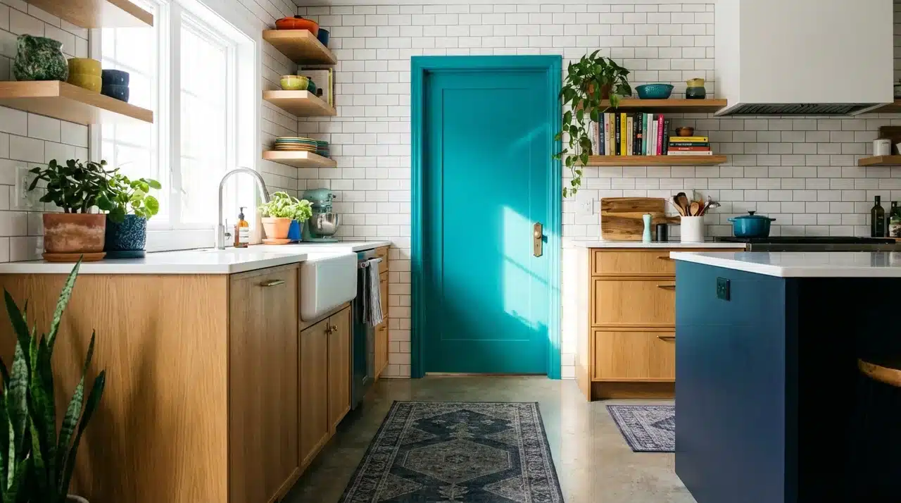
Teal doors add a crisp, lively energy and a clean visual freshness to quiet spaces that need more character.
- Recommended Finish: Satin for a smooth, cleanable, and color-rich visual surface result
- Pairs Well With: White walls, light wood, and muted grey or navy accents complement it
- Where to Use: Kitchens and bathrooms are the best rooms for a cool teal interior door
A clean, current color with strong staying power that fits well and looks right in practically any style of home.
Tip: Teal can read very differently in warm vs. cool light. Test it in both your morning and evening lighting before committing.
12. Soft Lavender for a Calm and Tranquil Space
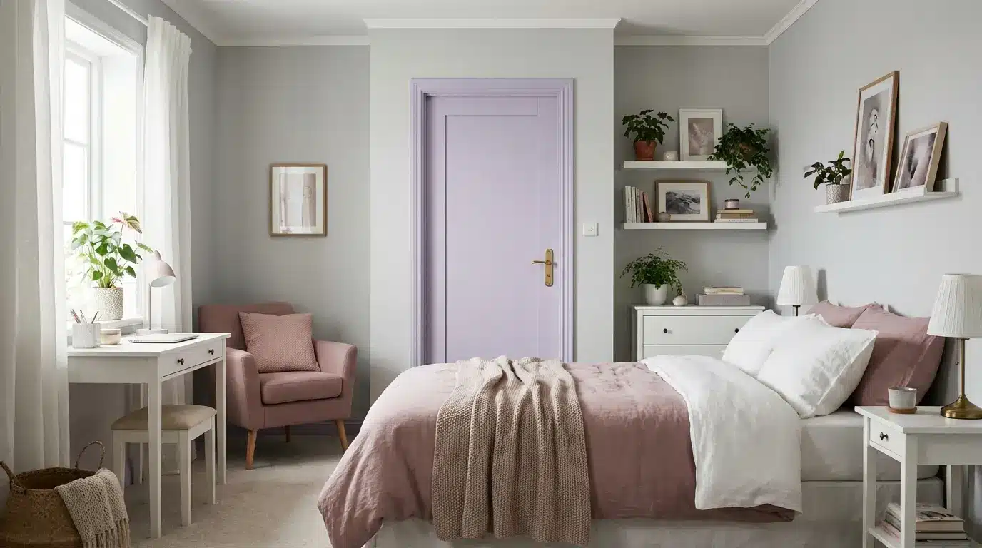
Lavender doors create a restful, gentle mood and bring a quiet sense of calm to any room they occupy.
- Recommended Finish: Eggshell or satin for a soft, low-key, and calming surface look throughout
- Pairs Well With: White, light grey, and dusty rose tones work beautifully alongside soft lavender
- Where to Use: Bedrooms and offices are the best spots for soft lavender interior doors.
A calm, quiet color with a soft, natural presence that leaves any space feeling fully settled and genuinely at ease.
What I Feel Like: Lavender in the bedroom changed how that room felt at night. Softer, quieter, more like a personal retreat than just a room.
13. Midnight Indigo for a Deep and Quietly Dramatic Edge
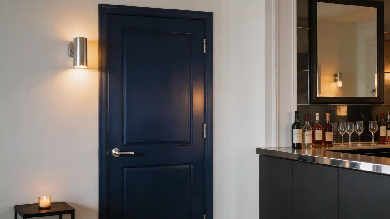
Midnight indigo doors make a moody, mysterious impression, carrying a rich urban drama in bedrooms and home bars.
- Recommended Finish: Satin or semi-gloss for a deep, smooth, and strikingly refined surface finish
- Pairs Well With: Silver or chrome hardware, soft white walls, and dark or mirrored accents complement midnight indigo well
- Where to Use: Bedrooms and home bars are where midnight indigo doors deliver the most dramatic depth
I command every room I occupy with a darkly alluring presence, yet I don’t just add personality, I become it. Deep, expressive, and unapologetically bold, I bring an air of mystery and nocturnal intrigue that transforms any space I touch.
Tip: Midnight indigo is a late-night door. It performs best in low, warm lighting so add a wall sconce nearby and the color comes alive with a richness that changes hour by hour.
14. Ocean Blue for a Breezy, Relaxing Vibe
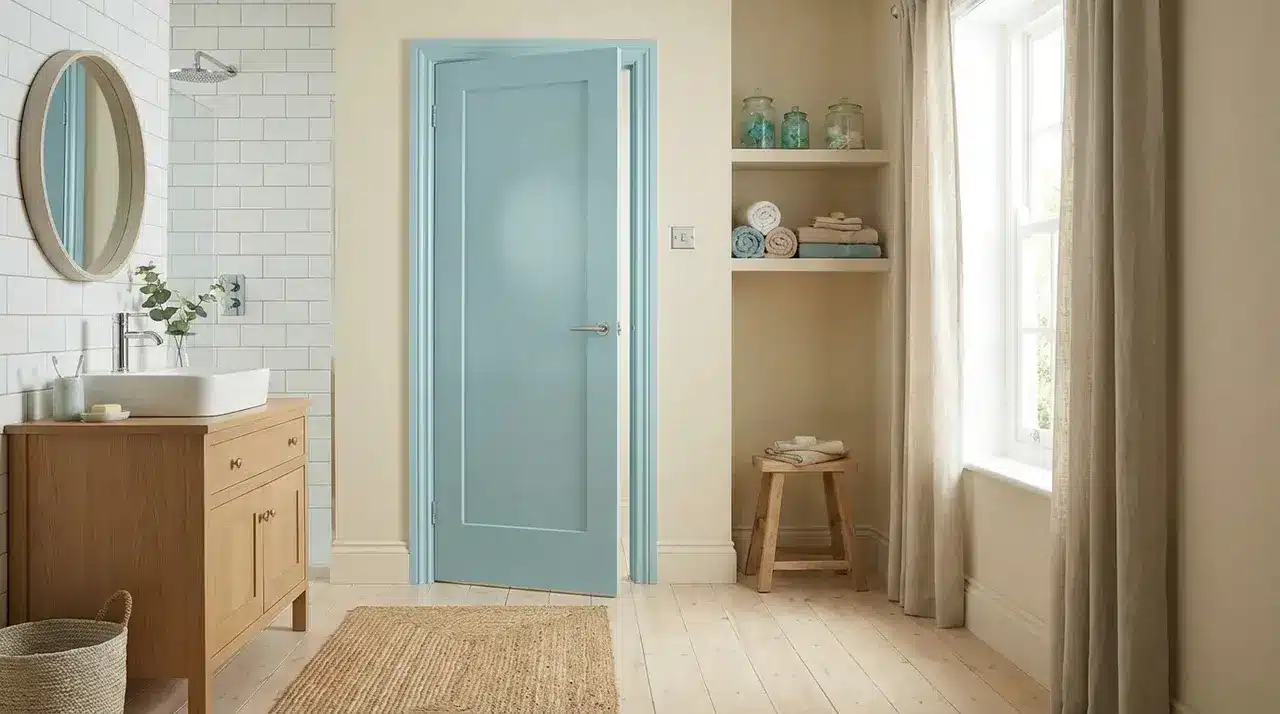
Ocean blue brings a calm, breezy quality and a genuinely relaxing feel to rooms that need to breathe.
- Recommended Finish: Eggshell delivers a soft, matte, and visually soothing quality on the surface
- Pairs Well With: Sandy neutrals, crisp white tiles, and light natural wood finishes look great with it
- Where to Use: Bathrooms and sunrooms are the most fitting rooms for ocean blue interior doors
A light, easy, and visually soothing color that makes any space feel genuinely restful and free of unnecessary visual strain.
What I Feel Like: Ocean blue on a bathroom door feels like a small holiday every morning. It brings that easy, coastal calm right into your daily routine.
15. Warm Honey Yellow for a Bright and Cheerful Space
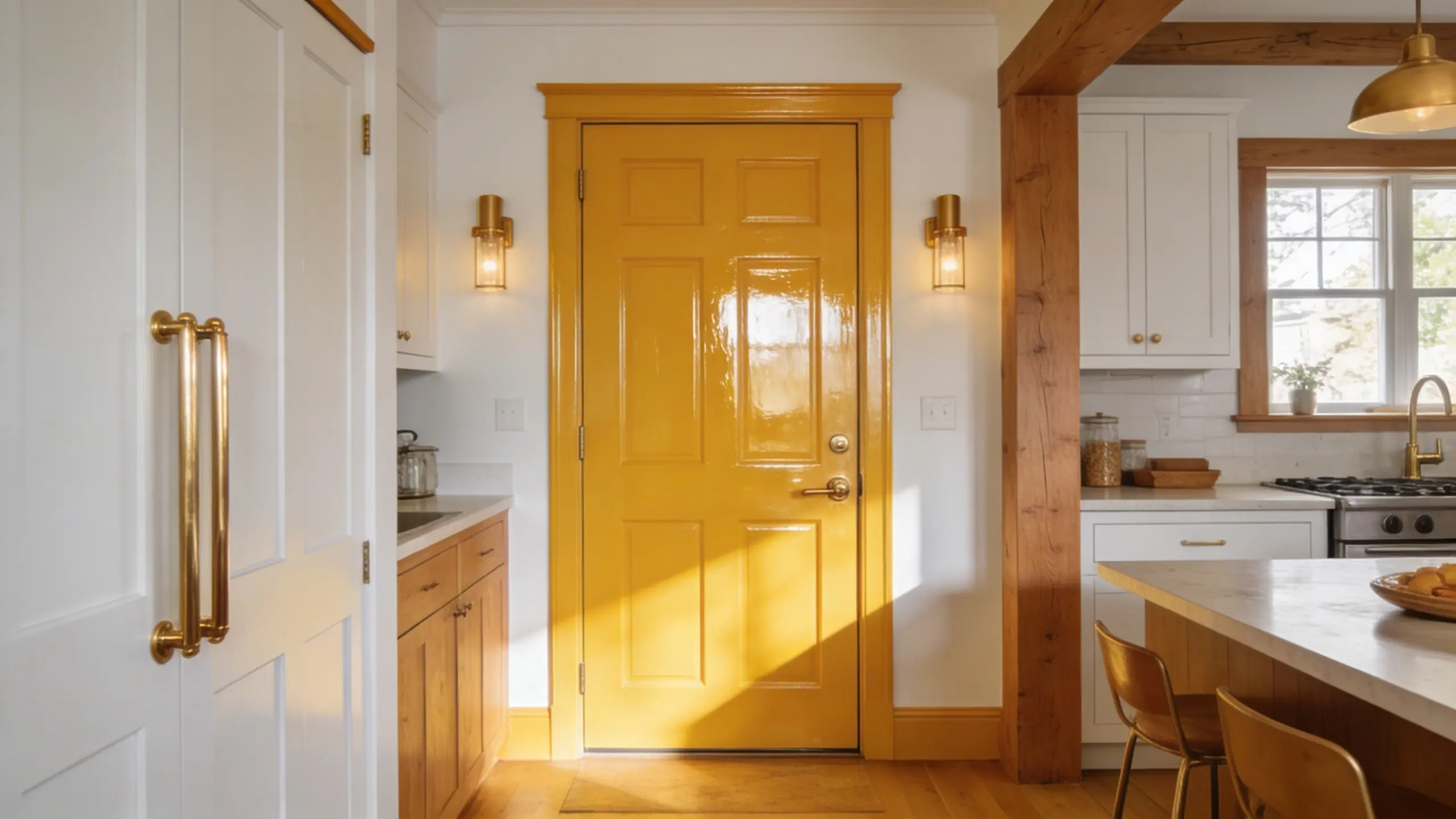
Warm honey yellow fills any space with real warmth and a cheerful, uplifting energy that makes an immediate positive impression.
- Finish: Semi-gloss keeps the color bright, vibrant, and very easy to clean
- Pairs Well With: White walls, natural oak wood, and warm terracotta or brass accents work best
- Where to Use: Kitchens and entryways benefit most from the warm energy of a honey yellow door
An uplifting, warm, and genuinely welcoming color that sets a strong positive tone and good energy right from the start.
Tip: Honey yellow looks its absolute best beside plants and greenery. If you have a kitchen herb shelf near the door, the pairing is stunning.
16. Charcoal Gray for a Sleek and Modern Feel
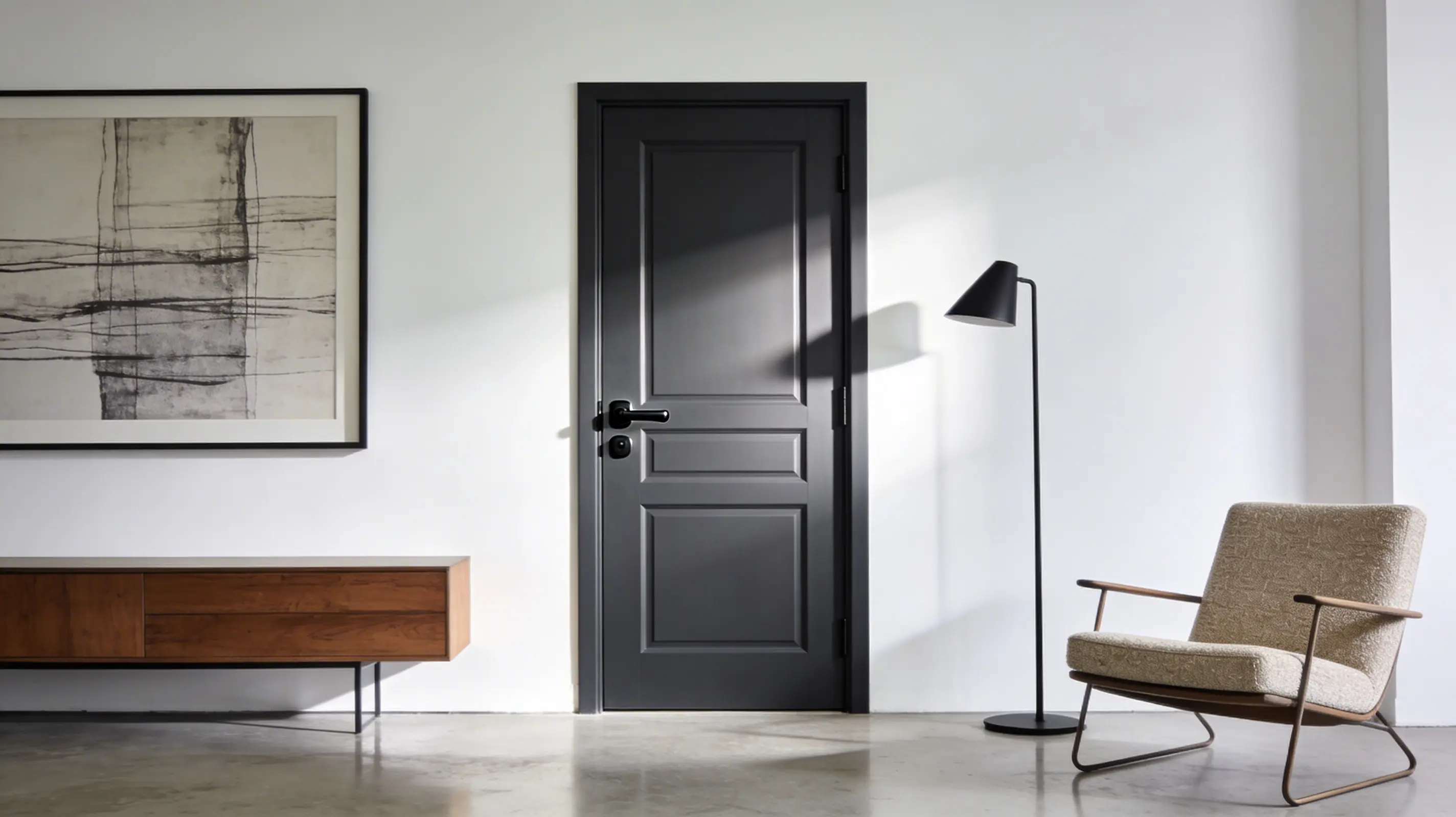
Charcoal grey brings a sleek, clean confidence and a strong sense of control to modern and contemporary spaces.
- Recommended Finish: Satin or semi-gloss for a sharp, smooth, and modern-looking surface finish
- Pairs Well With: White, black, cool blue, and warm wood tones all complement charcoal grey well
- Where to Use: Offices and living rooms are the best places for charcoal grey interior doors
A reliable, visually strong color with wide appeal that fits comfortably into most interior design styles and works almost anywhere.
What I Feel Like: Charcoal is a subtle yet refined choice for door colors. It makes a strong impression without overwhelming the room. I find it incredibly adaptable and easy to incorporate into any space.
17. Powder Blush for a Whisper Warm and Effortlessly Soft Touch
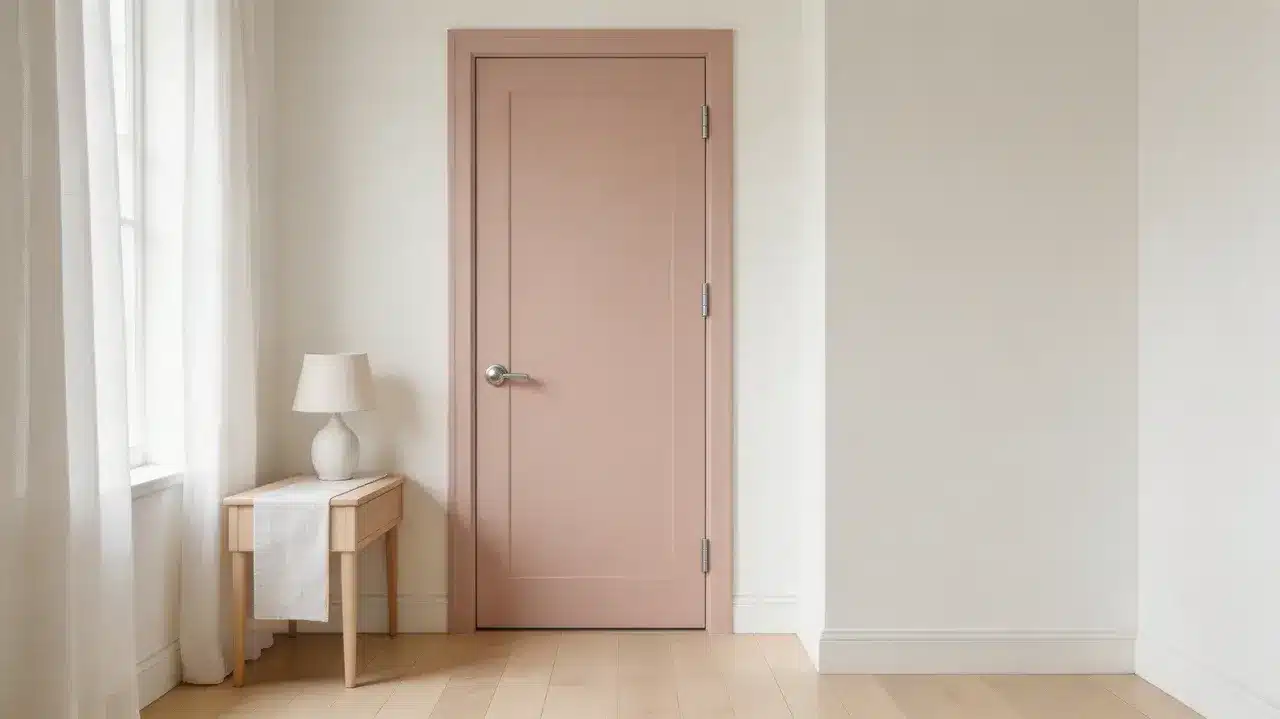
Powder blush doors make a near-neutral, whisper-warm impression, carrying a soft and barely committed pink tone in hallways and bedrooms.
- Recommended Finish: Eggshell for a delicate, low-sheen, and quietly warm surface appearance throughout
- Pairs Well With: Soft white walls, linen textiles, pale wood floors, and matte silver hardware complement powder blush well
- Where to Use: Hallways and bedrooms are where powder blush doors deliver the most effortless, barely-there warmth
A fearless, understated color pick that adds real softness, personality, and a warmly neutral, almost-pink presence to every room it occupies.
Tip: Powder blush is a whole-home door. If you want something warmer than white but quieter than pink, this is the shade that works across every room without ever asking for attention
18. Coral for a Vibrant and Playful Door
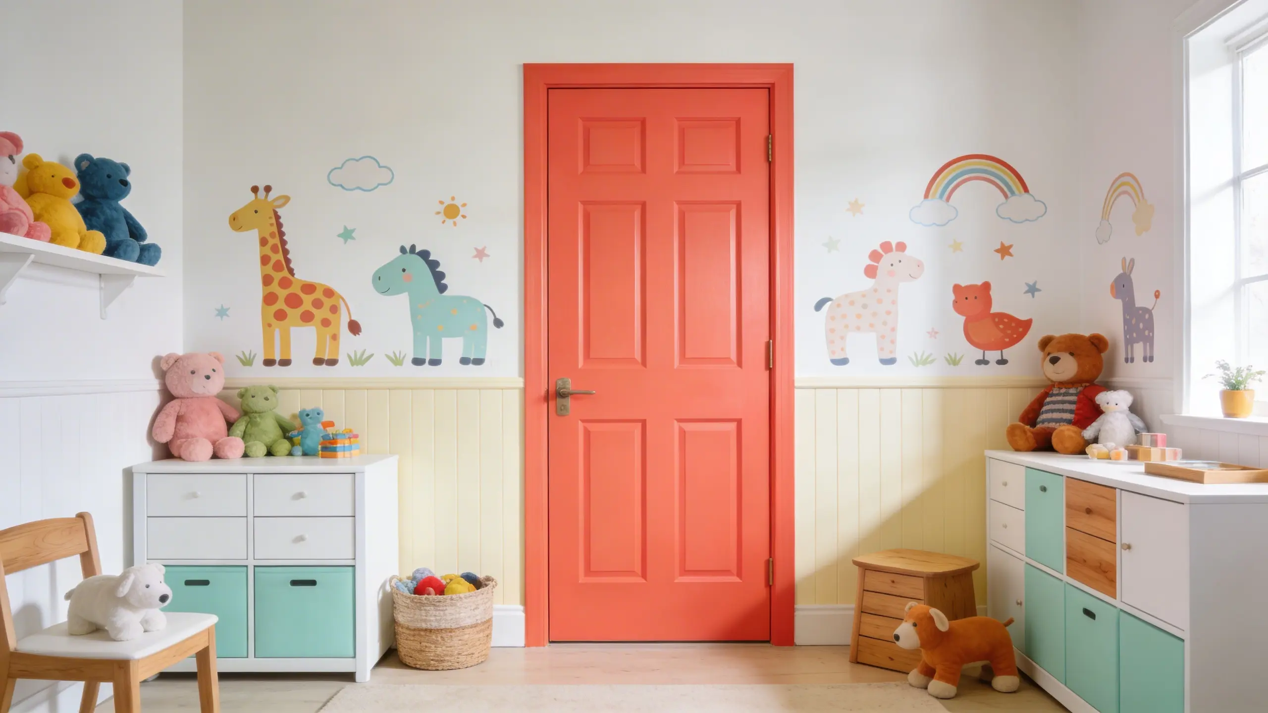
Coral doors add a fun, vibrant pop of warm color that brings instant energy and real personality to any room.
- Recommended Finish: Satin for a smooth, bright, and long-lasting color on the door surface
- Pairs Well With: White, cream, soft mint, and natural wood tones all work great with coral
- Where to Use: Kids’ rooms and bathrooms are the ideal spots for a lively coral door color
A warm, high-energy color full of personality that brings instant life and a genuinely upbeat quality to rooms of all kinds.
What I Feel Like: Coral is pure happiness on a door. It reminds me of summer fruit and sunsets , the kind of color that makes you smile when you walk past.
19. Terracotta for a Warm and Sun-Soaked Atmosphere
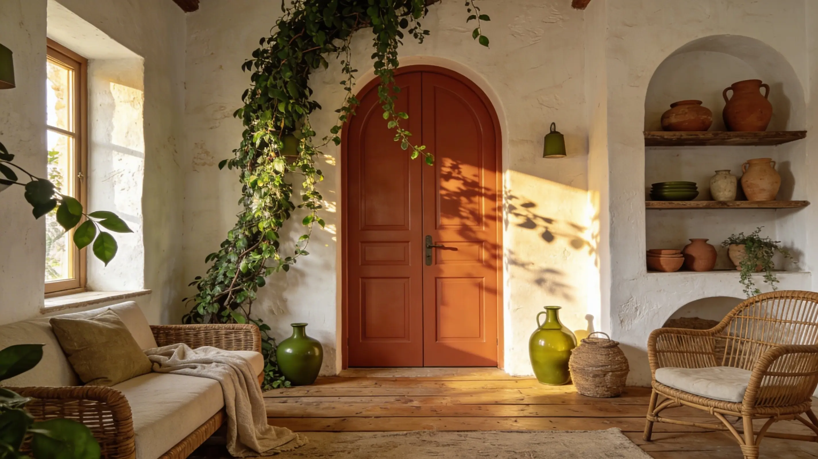
Terracotta doors make a warm, sun-soaked impression, carrying a Mediterranean soul in kitchens and living rooms.
- Recommended Finish: Satin for a warm, smooth, and beautifully lasting color on the door surface
- Pairs Well With: Olive green accents, warm white walls, natural clay pots, and rattan or linen complement terracotta well
- Where to Use: Kitchens and living rooms are where terracotta doors deliver the most joyful, earthy warmth.
A deeply warm, life-affirming color pick that adds real energy, personality, and a sun-drenched, earthy presence to every room it occupies.
Tip: Terracotta loves a sun-filled spot. Put it near a window, add a trailing plant or a clay pot close by, and the whole thing comes together without any effort at all.
Common Mistakes to Avoid When Painting Doors
Even the best door color can fall flat if the painting process goes wrong. Avoiding these three common mistakes makes all the difference.
- Not Preparing the Surface Properly: Skipping sanding and priming leads to poor adhesion, uneven coverage, and premature peeling. Always prep the surface thoroughly before applying any paint coat.
- Choosing the Wrong Finish: High-gloss finishes highlight imperfections on frequently used doors. Satin or eggshell offers better durability and a far more forgiving, practical surface result.
- Rushing the Process: Applying coats before the previous coat fully dries can cause streaking and peeling. Always follow recommended drying times for a smooth, long-lasting, professional finish.
Getting these basics right takes little extra time but makes a significant difference to how your finished door looks and how long it lasts.
How to Incorporate Painted Doors into Your Home’s Design
The right interior door colors do more than add visual interest. They shape how a room feels, flows, and comes together as a complete space.
- Look at Your Dominant Tones: Choose interior door colors that naturally extend your room’s palette. Consider furniture, flooring, and lighting. Earthy spaces pair well with rich browns or deep greens for a cohesive look.
- Statement with One Bold Door: If your home is mostly neutral, paint just one door (entry or study) in a bold color like deep teal or burgundy. Keep all others white to avoid visual chaos.
When chosen thoughtfully, interior door colors are among the simplest and most rewarding design decisions for your entire home.
Wrapping It Up
Painting your interior doors is one of the simplest ways to give your home a fresh, pulled-together feel. The right interior door colors can shift the entire mood of a room, turning something you walk past daily into a real design feature.
Every interior door color idea I’ve shared comes paired with the right finish, room, and lighting match. But a color you love still needs to work with your space. Sample it first, test it in different lights, and go with what feels right on the actual door.
Ready to refresh your next home? Head over to our blog for more real, simple ideas that make everyday living feel a little more. you
Frequently Asked Questions
Should every room in your home have the same door color?
Not necessarily. Painting all doors the same color creates a clean, unified flow throughout your home. Different colors per room add personality and character, but work best when the overall palette stays connected. Choose based on how open or distinct you want each space to feel.
How Do I Ensure Even Coverage on Interior Doors?
Start by sanding the surface and applying a good primer. Use a quality brush for edges and a foam roller for flat panels. Work in long, steady strokes, keep coats thin, and let each one dry fully before adding the next. Rushing between coats is where most people go wrong.
How to Choose a Door Color for a Small Room?
Stick to lighter shades like soft gray, mint green, or warm white. These colors reflect natural light well, making a small room feel more open and less boxed in. If you want something with a little more personality, a muted pastel works just as well without closing the space down.